Vermilion Cliffs
EF_27©26
Context
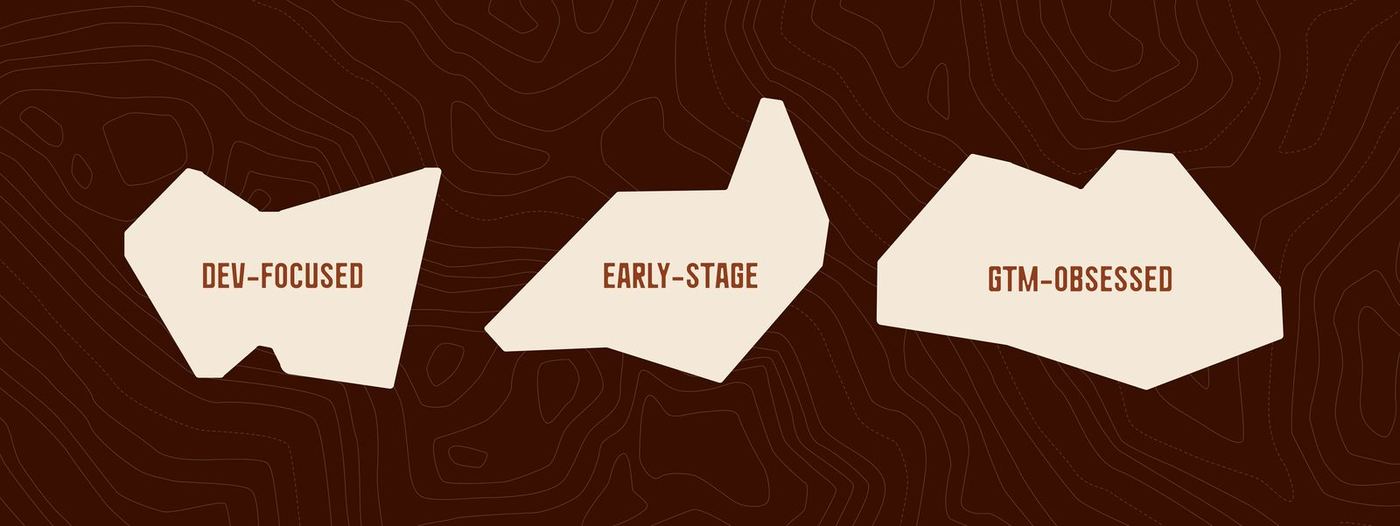
A rugged brand identity and digital system for a venture fund backing the next generation of developer‑led companies. Vermilion Cliffs Ventures is founder‑first and operator‑led: they invest early, when belief outweighs traction.
Rugged, founder‑first VC fund for technical builders.
01 — Overview
They stay close to founders, bringing capital plus the firepower to reach market.
We sharpened the voice and rebuilt the system: a full identity refresh and a new website designed to carry weight, signal conviction, and tell the story forward.
02 — Design system
Type
Geometric sans‑serif shapes balance professionalism with approachability: precision with a friendly tone.
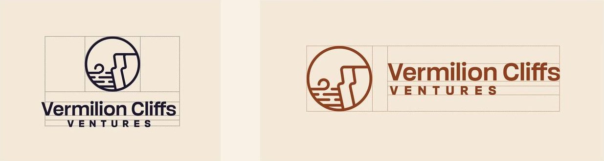
Lockups
The vertical lockup is for reduced spaces, where a compact mark conveys solidity. The horizontal lockup is built for speed and clarity in digital spaces.
Colour
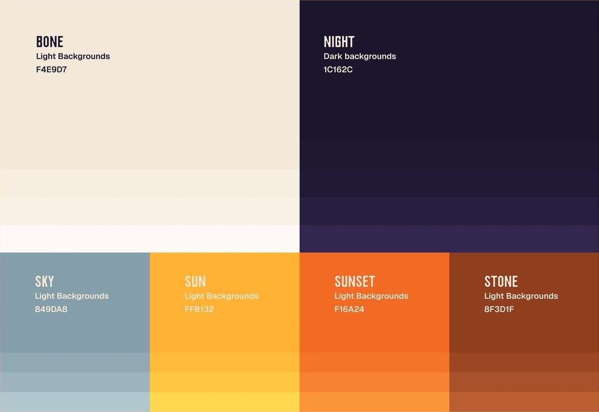
Desert contrast: Bone and Night for clarity and trust, Sky to keep the system calm, Sun and Sunset for moments of action, Stone to ground the warm spectrum.
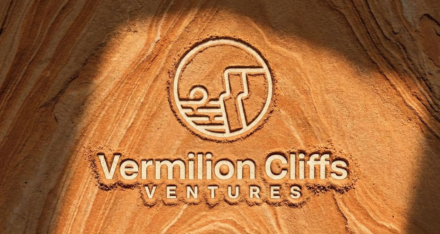
03 — Illustration & graphics
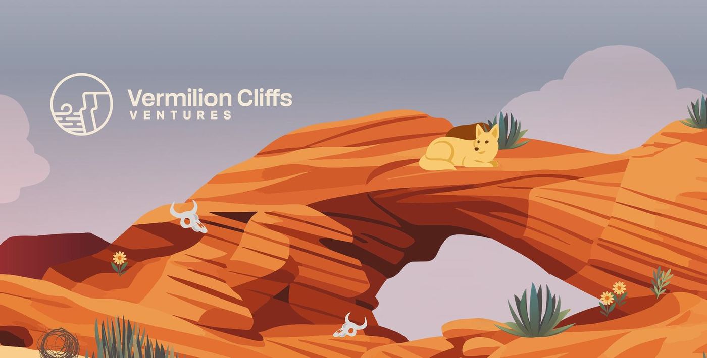
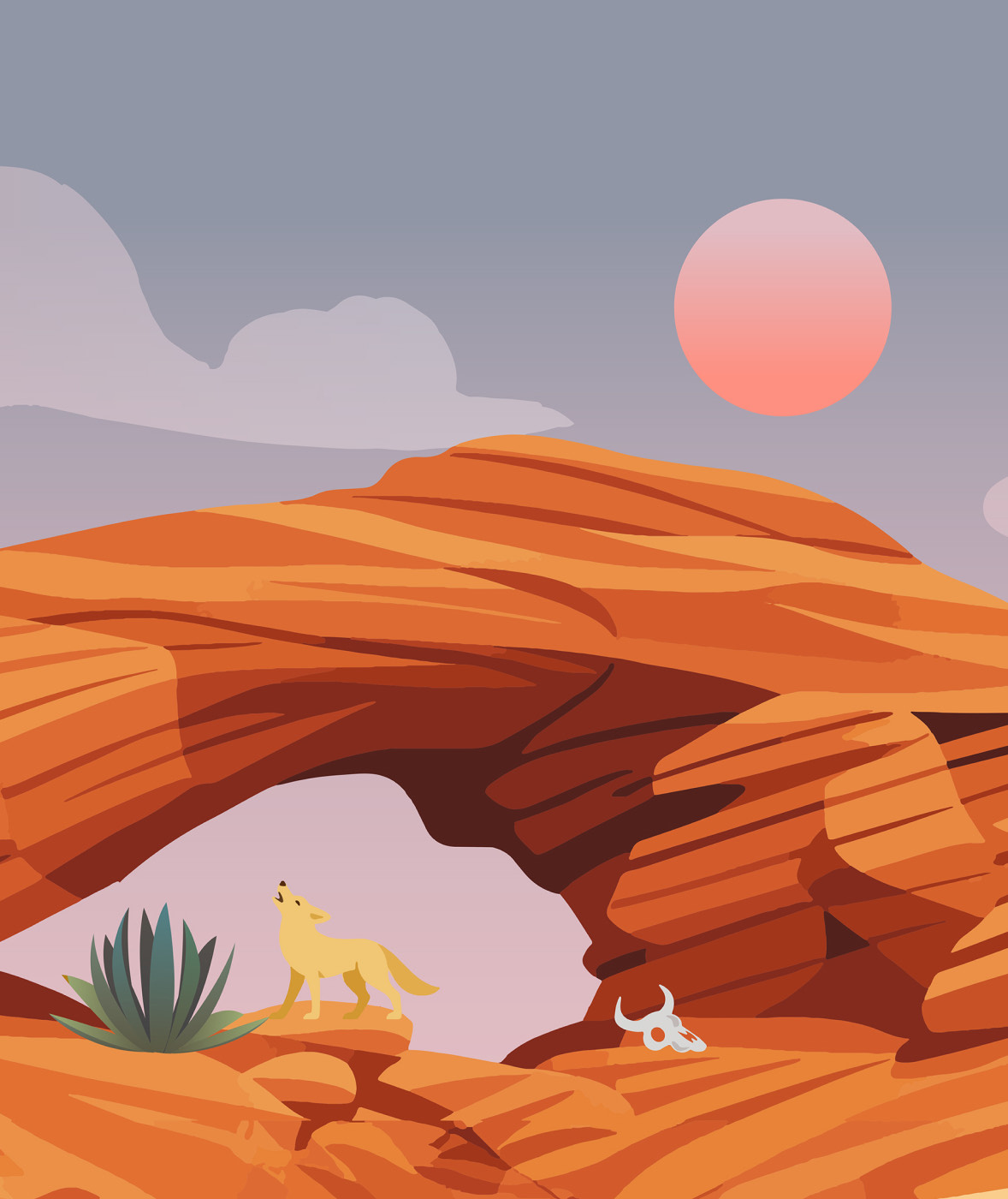
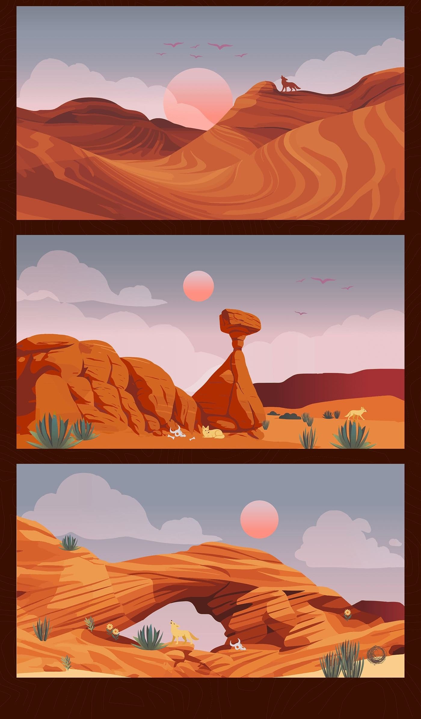
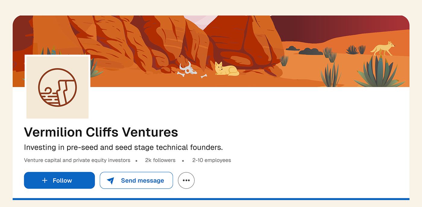
A desert drawn for the brand: sandstone arch, coyote, agave and a low sun.
Scenes by Male Cuellar give Vermilion Cliffs a distinct world and a recognisable signature. Used as hero moments and section breaks, they bring continuity without competing with the portfolio and proof.
04 — Web design
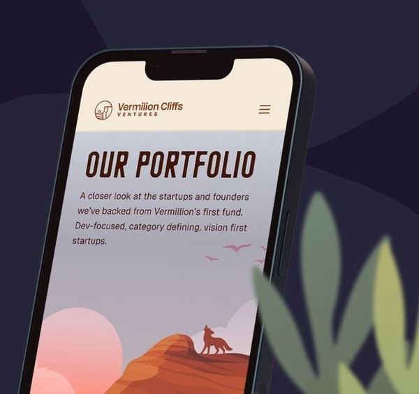
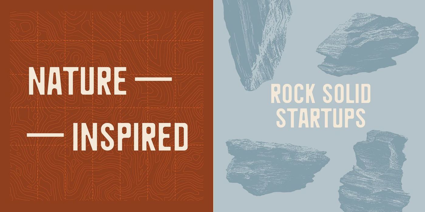
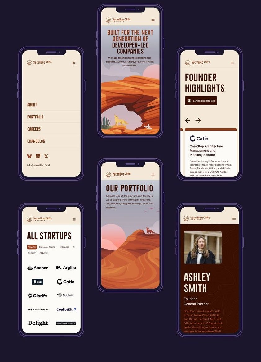
The site was designed to feel confident, fast and founder‑forward: a strong typographic hierarchy, simple navigation, and a portfolio system that makes the fund's focus easy to understand at a glance. Custom illustrations and terrain details add attitude and worldbuilding without getting in the way of proof.
05 — Applications
Asset library
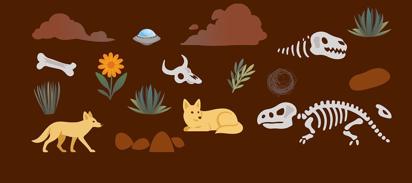
A set of custom illustrations and UI assets used throughout the site adds personality and continuity across pages while keeping layouts clean.
Touchpoints
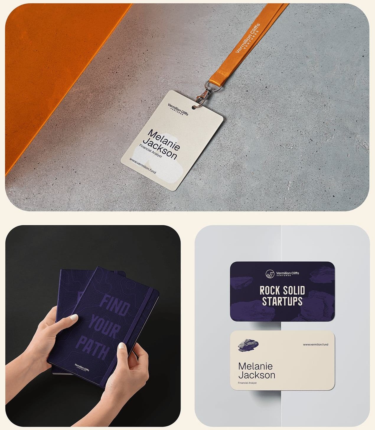
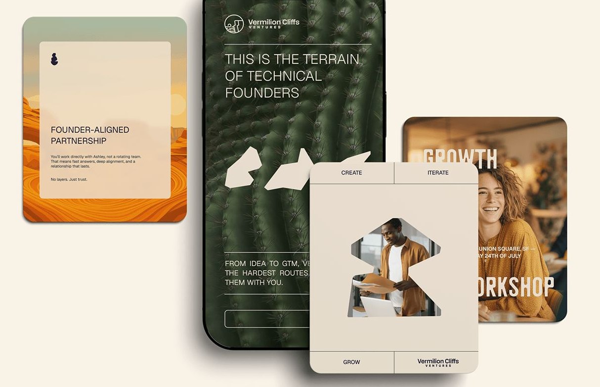
Badges, stationery and business cards reinforce the founder‑first tone: confident typography, high‑contrast layouts, terrain details used with restraint.
Social
The system carries onto LinkedIn and into posts and stories, recognisable from first meeting to portfolio proof.
06 — From the ground to the sky
A brand system designed to scale, built to perform in the market.
We delivered an identity that unifies Vermilion's voice and visuals, creating clarity across every platform: flexible enough to scale, distinct enough to cut through the noise.
Desert contrast, operator conviction.
Have a brand that needs this kind of thinking?
Tell us what you are building. We take on a small number of projects at a time, across brand, design and performance.