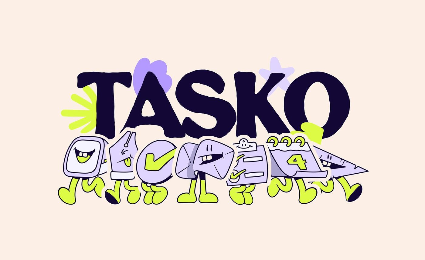
Tasko
EF_32©26
Context
Tasko is an on‑demand support brand built around one idea: give people their time back. Through admin, creative and digital support, it helps teams clear backlog, move faster and focus on what drives their business forward.
Reclaim your time. Focus on what matters. Get sh*t done.
01 — The challenge
Most tools in this space lean heavily on function, often at the expense of personality. The challenge was to design a system that feels efficient without becoming cold: one that stands out visually while staying easy to understand and use day to day, with a tone that carries consistently across both visuals and messaging. Tasko needed a brand that feels immediate, friendly and focused on getting things done.
02 — Concept & direction
Your team should be able to log off at 5.
The direction focuses on ease and speed, helping get work off your plate while staying friendly and approachable. Messaging is direct and confident, while visuals reinforce a human sense of support, keeping the tone close and never overly corporate. Less noise, more flow: a clearer way to get things done.
03 — Visual identity
Logotype
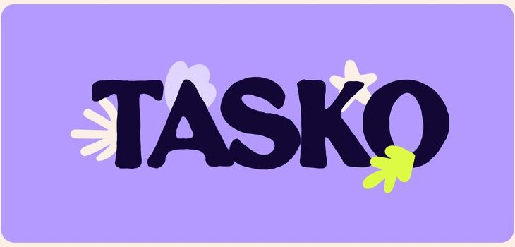
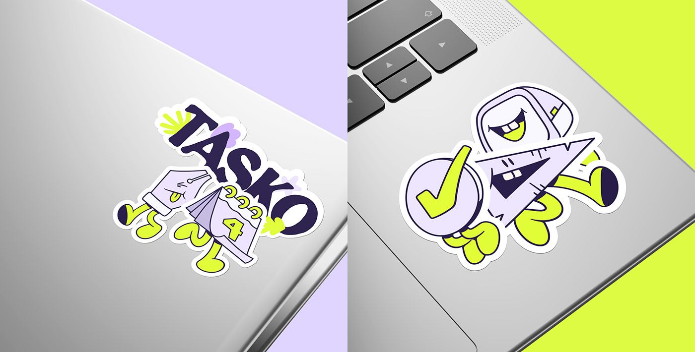
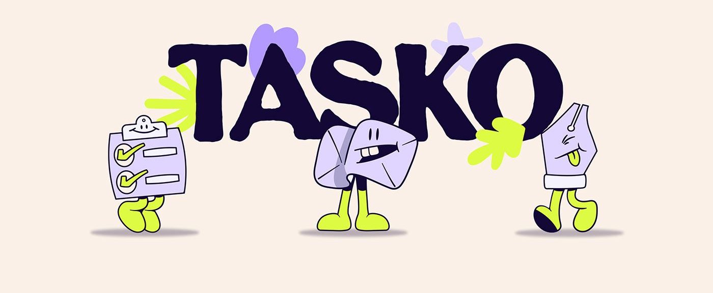
Custom drawn with irregular contours and slightly exaggerated shapes. The imperfections give it character and reflect the brand's hands‑on, get‑it‑done attitude.
Colour
Deep Purple, Focus Lime, Mid Purple and Soft Lilac. Vivid and expressive, so the brand feels less rigid and more human; used with the illustration system to keep things simple and easy to engage with.
Graphic language
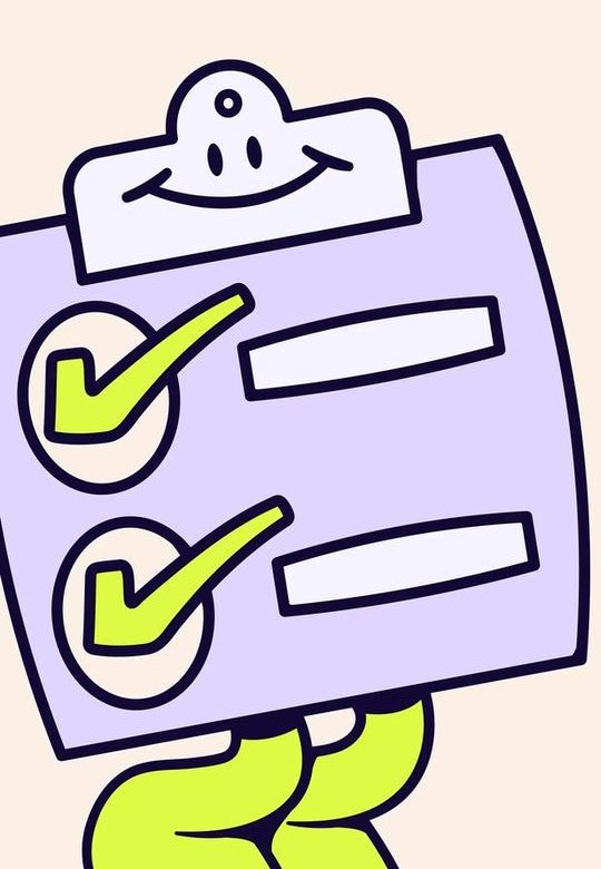
Led by the illustration system: bold, simple drawings that communicate handing off work, progress and completion while keeping the system consistent and easy to recognise.


04 — Illustration language
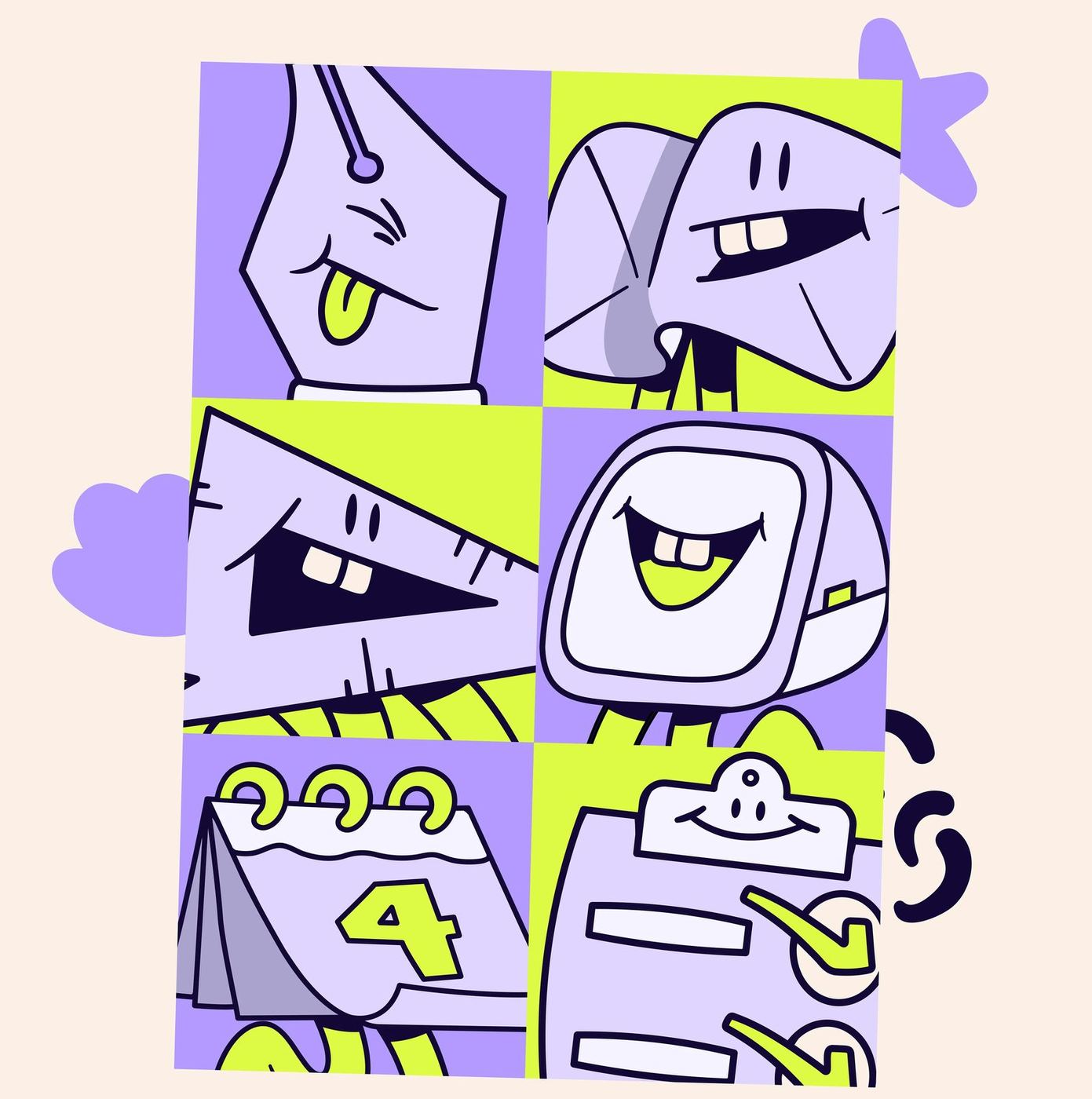
Illustration plays a central role in how Tasko communicates.
Characters are simple, bold and slightly playful, bringing personality without slowing the experience. Rather than decoration, they support the message: work getting handled, tasks moving forward, completion.
Icons
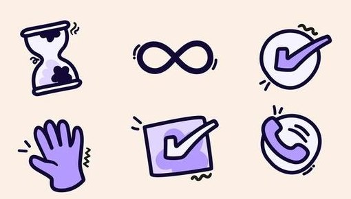
Built for simplicity and clarity. Clean, consistent shapes make them easy to recognise and help users navigate quickly, with subtle playful details that tie them to the illustration system.
Doodles
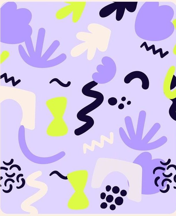
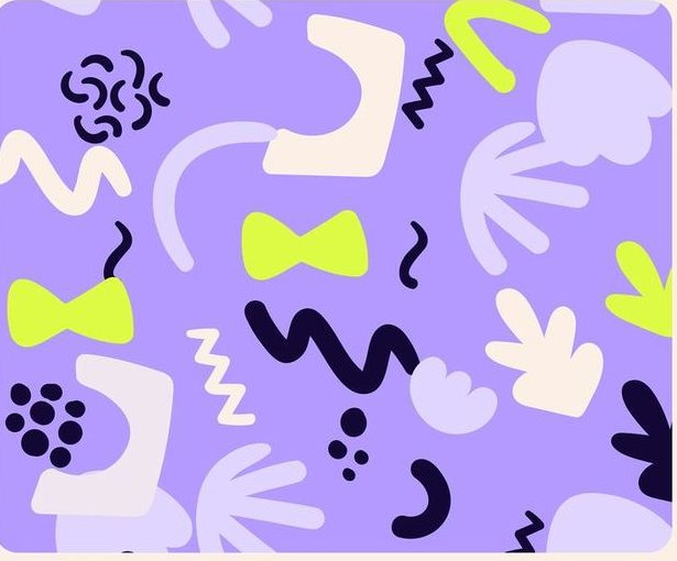
A spontaneous, expressive layer. As supporting elements they bring energy and play without overwhelming the content, reinforcing Tasko's friendly, creative personality.
05 — UX direction & landing page
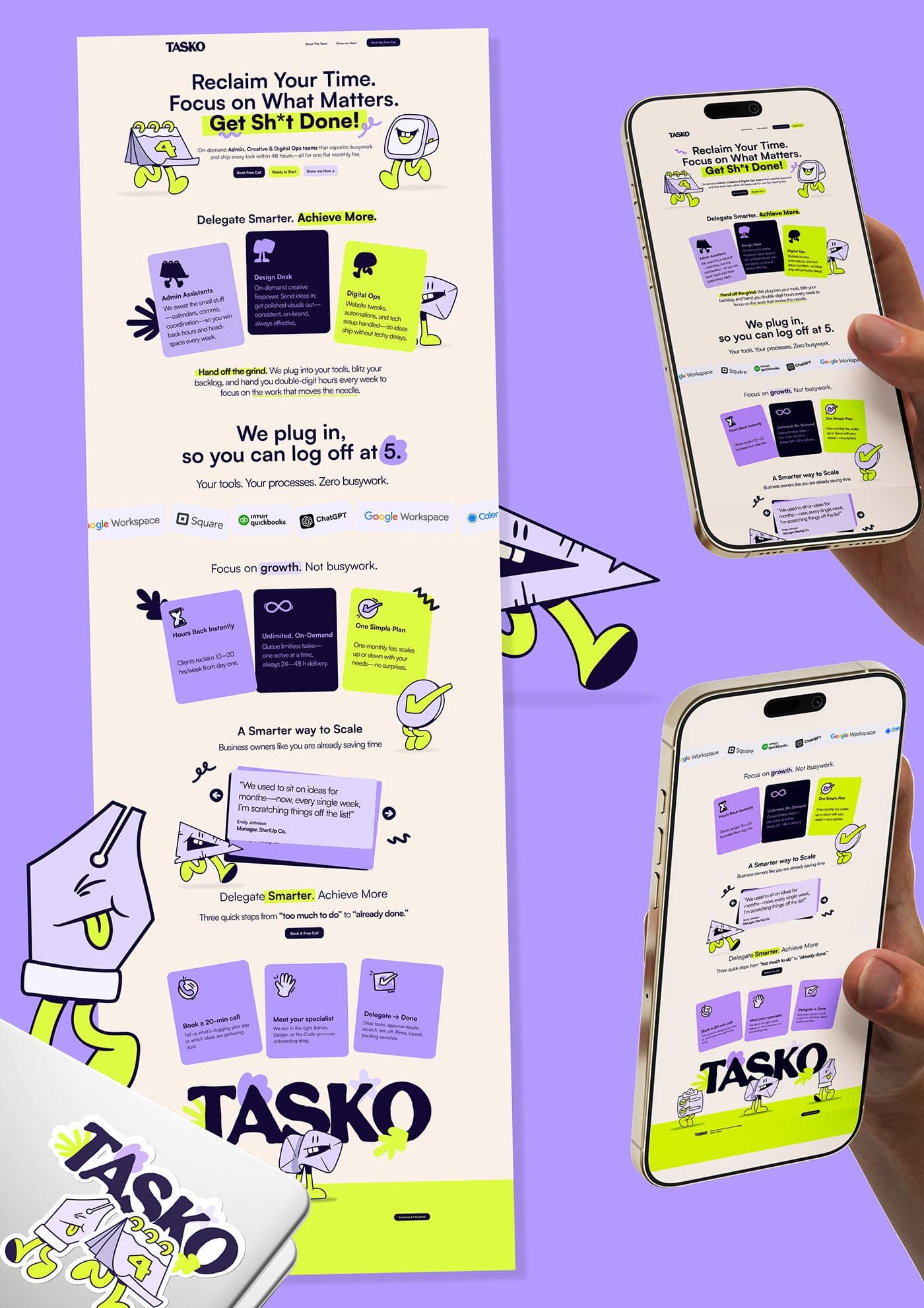
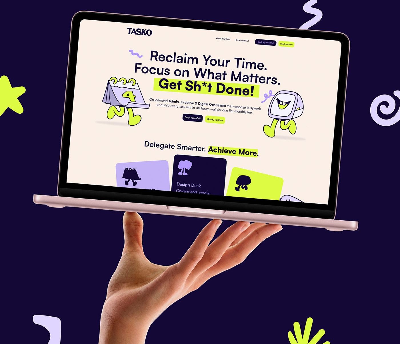
The landing page brings the brand into a clear, focused digital experience. Its structure communicates value quickly through direct messaging and a natural flow, so you can get work off your plate and move on with your day. Navigation stays simple and content easy to grasp at a glance, with straightforward interactions and minimal friction.
06 — Outcome
Tasko comes together as an active, friendly and easy‑to‑engage brand.
The identity, illustration language and digital experience reinforce one idea: work gets handled, helping teams get things done and actually log off.
Your time, handed back.
Have a brand that needs this kind of thinking?
Tell us what you are building. We take on a small number of projects at a time, across brand, design and performance.