Que Rico Frito
EF_28©26
Context
Frito was born from an obsession with fried chicken done right — a fast‑casual concept where technique, top‑quality ingredients and unapologetic passion turn a familiar comfort food into a bold, craveable experience.
Not a redesign for the sake of aesthetics — a voice as sharp as the cooking.
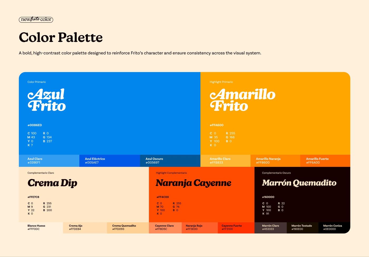
A bold, high‑contrast palette designed to reinforce Frito's character and hold consistency across the visual system.
The work
New typography, more confidence across every format.
The typography was replaced to better reflect Frito's bold, energetic character, improving legibility, consistency and personality. It is paired with a grotesque family — functional, neutral and visually clean, balanced on paper but full of details that give it a personality of its own.
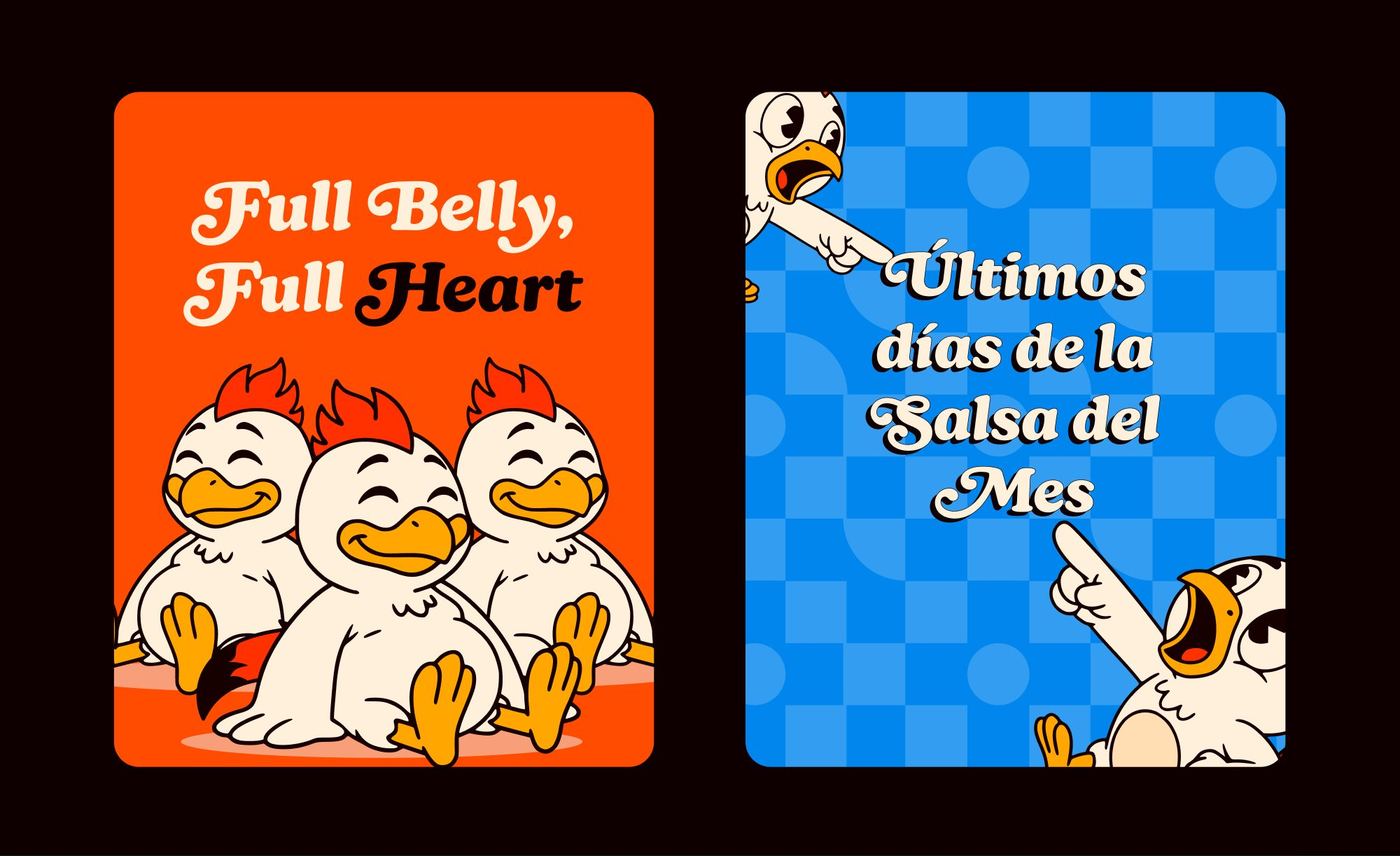
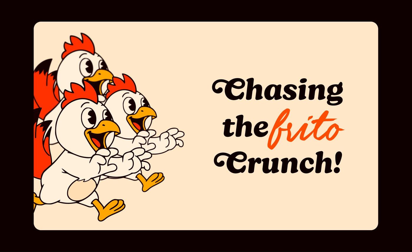

Custom textures and patterns add depth, rhythm and character — inspired by Frito's bold and indulgent nature, supporting the identity without overpowering it.
Crispy, juicy, and unapologetically bold.
Have a brand that needs this kind of thinking?
Tell us what you are building. We take on a small number of projects at a time, across brand, design and performance.