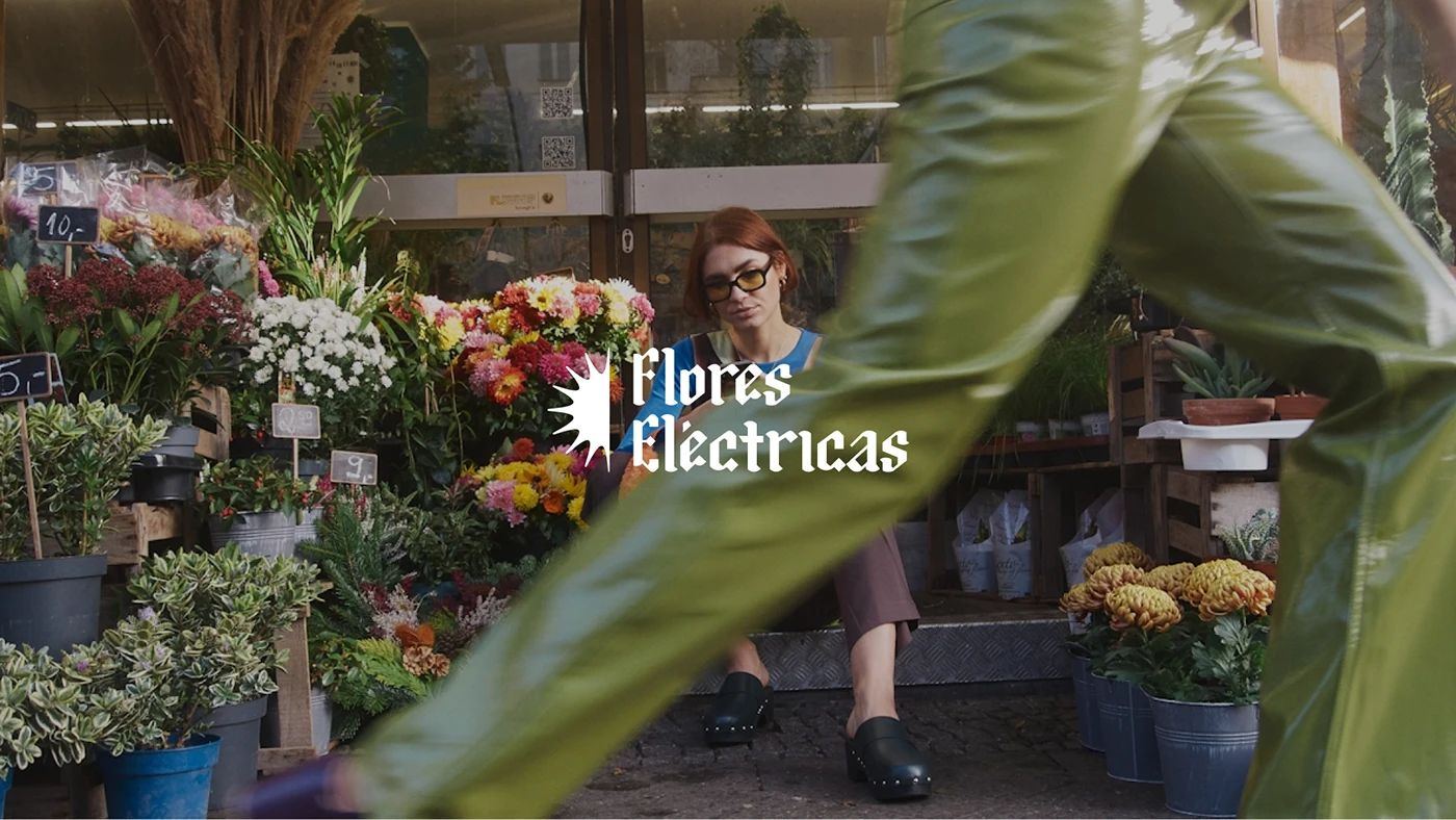
Flores Eléctricas
EF_19©24
Context
Flores Eléctricas is a production house born from a love and passion for creation, for storytelling and for filmmaking. We partnered with the team to design their name, brand and visual applications, aligned with their creative vision and bold storytelling approach.
Stories that stir, challenge, move and inspire.
01 — The studio
Cinema and communication are their ways of exploring creativity. From radio spots to feature films, they collaborate with bold individuals who seek to tell stories in disruptive ways: to express themselves, create impact and deeply connect with their audience.
02 — Symbol & logotype
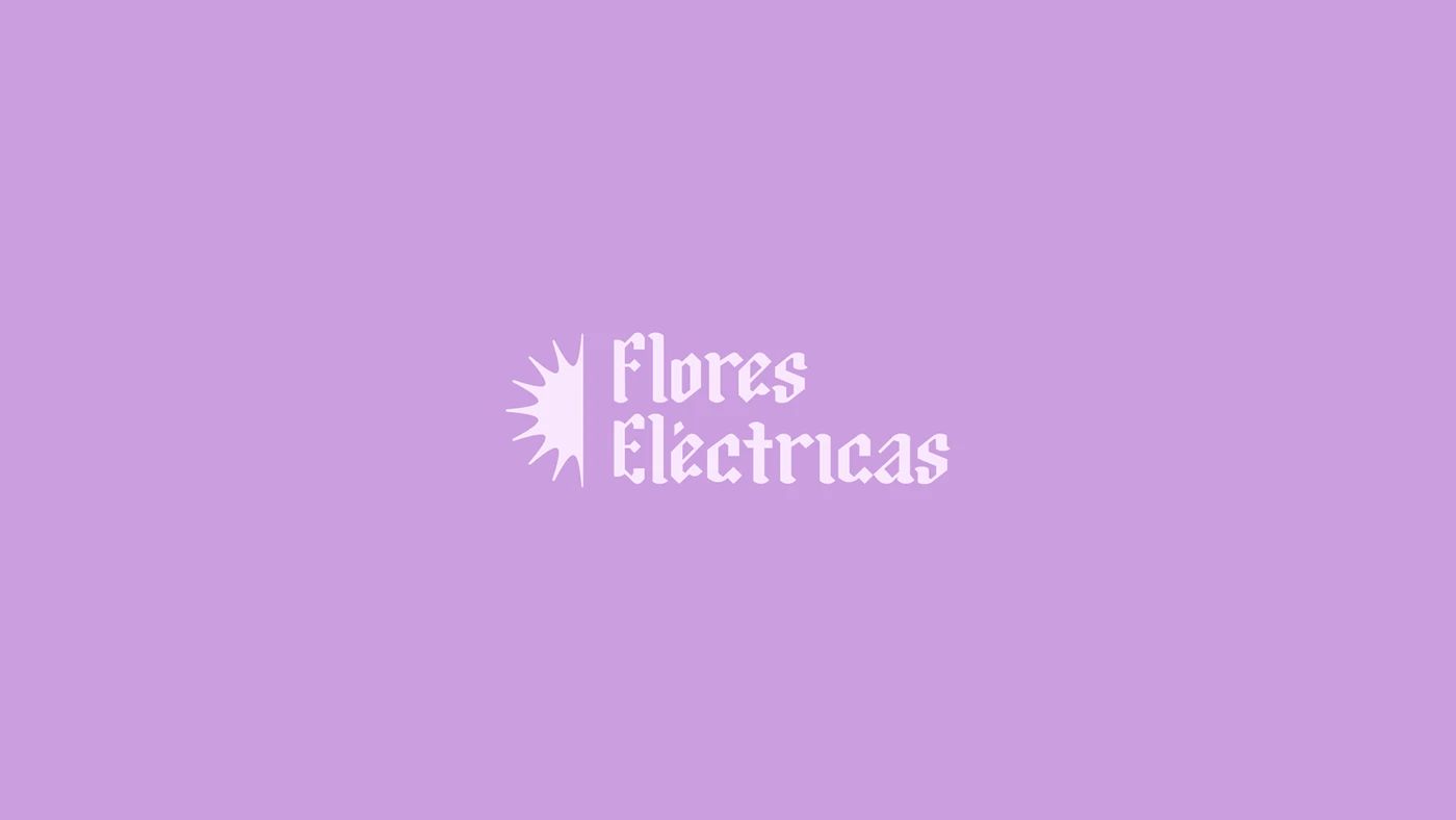
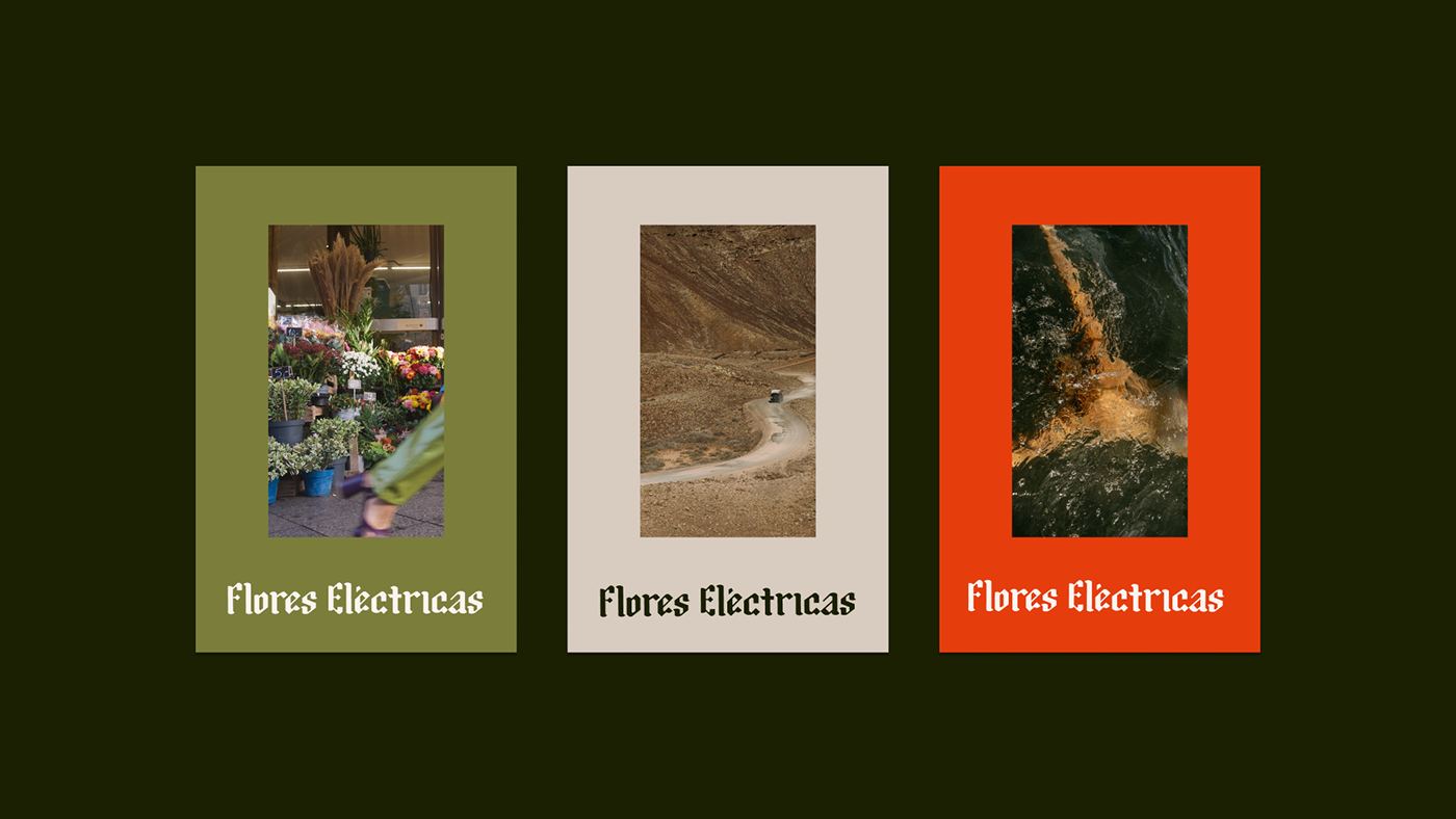
A spiked, radiating flower as the symbol, paired with a blackletter‑inspired logotype.


03 — Typography & colour
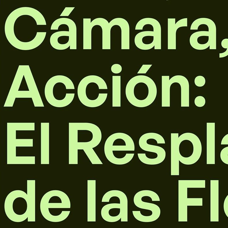
General Sans
Headlines are set in General Sans, a clean, modern geometric sans‑serif that complements the aggressive graphic style of the logotype and gives strong, clear, legible headlines.
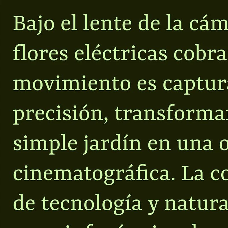
Yrsa
Text is set in Yrsa, a modern typeface that pays homage to classic serifs. Mixing the classic with the modern creates a contrast that brings a dynamic look to any composition.
Colour
A palette led by Verde Noche and Naranja Eléctrico, with Lavanda, Olivo and Gris Tierra, each paired with a secondary shade.
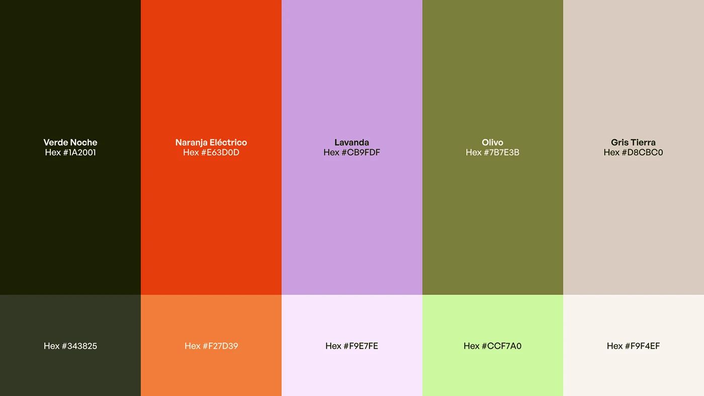
Verde Noche #1A2001, Naranja Eléctrico #E63D0D, Lavanda #CB9FDF, Olivo #7B7E3B and Gris Tierra #D8CBC0, each paired with a secondary shade.
04 — Applications
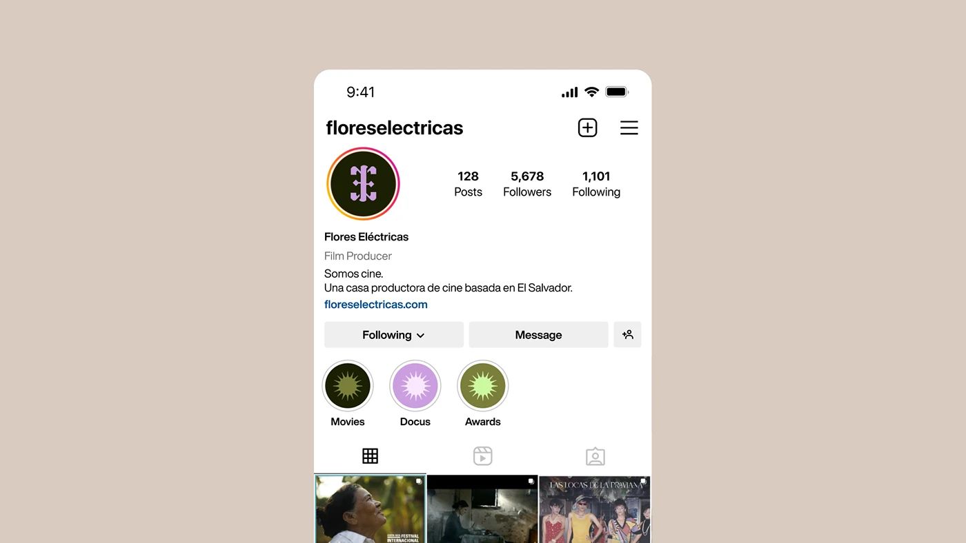
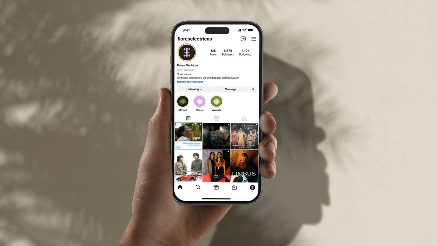
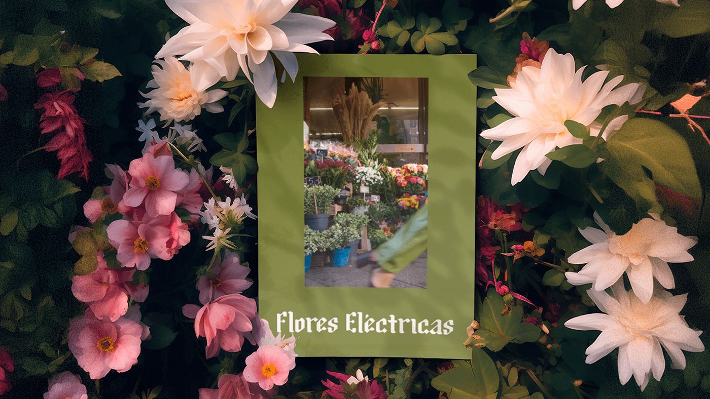
The brand across film stills, print, social and apparel.
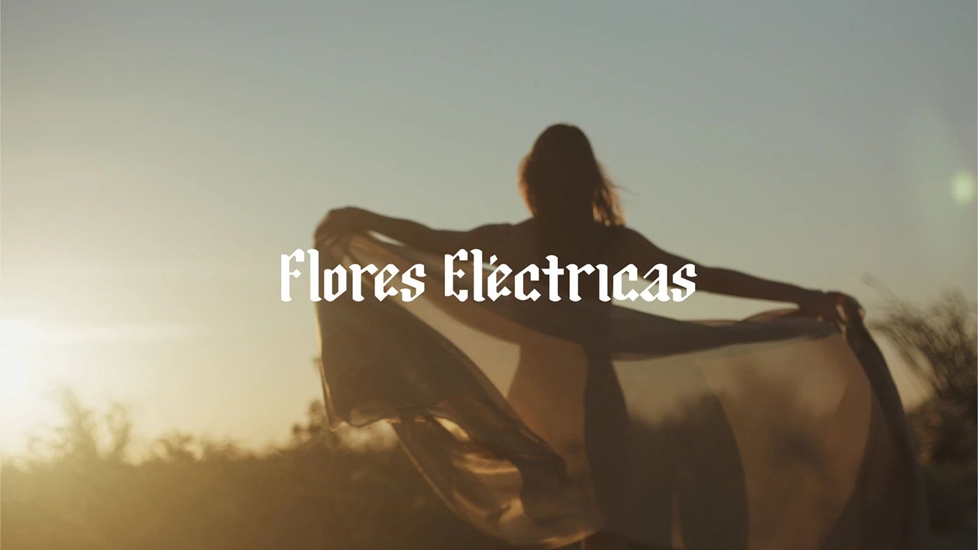
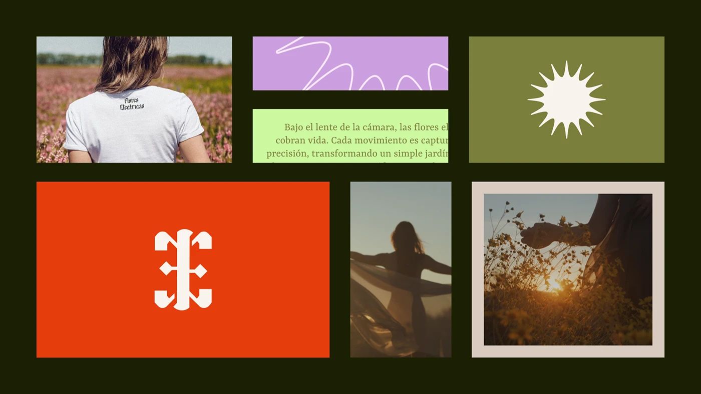
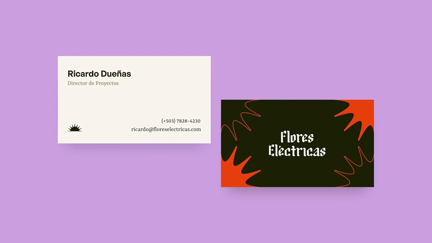
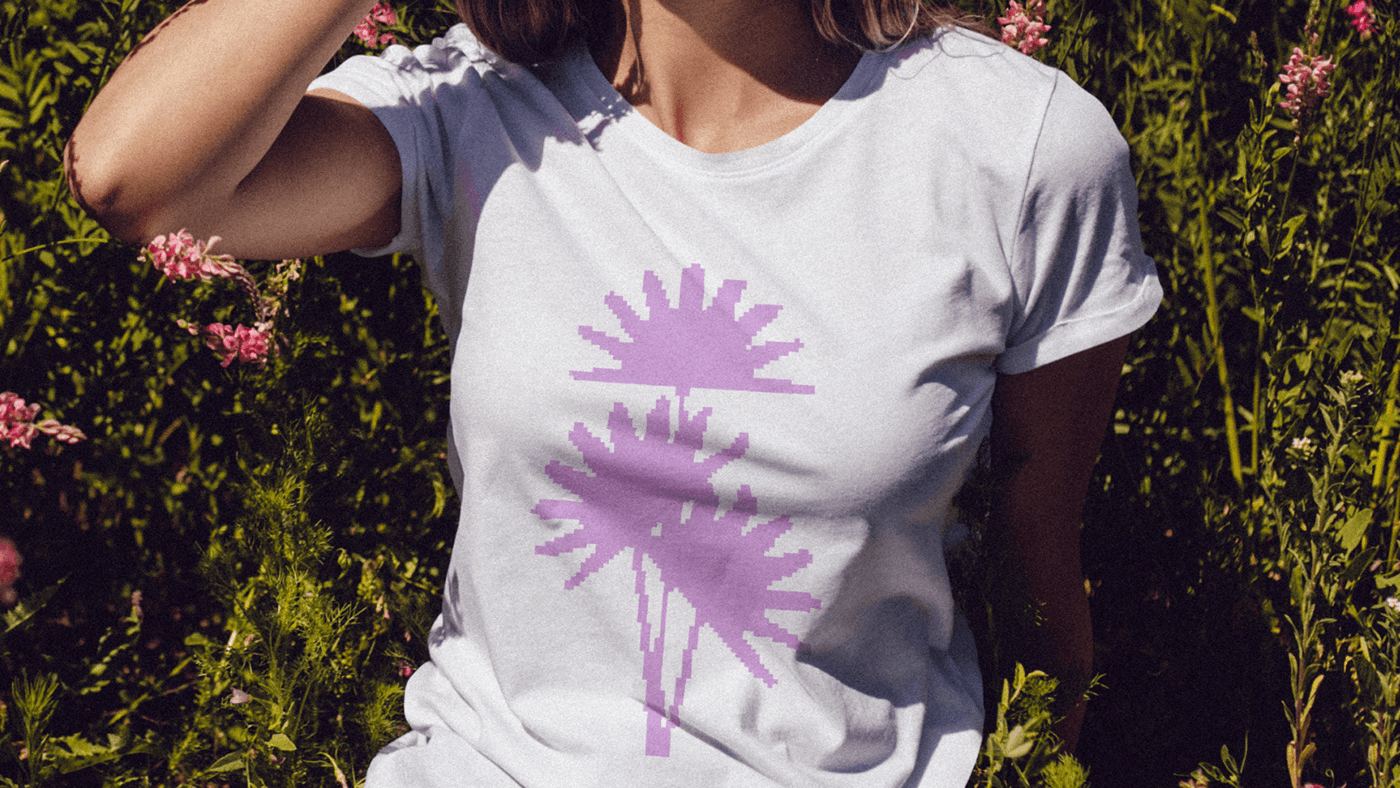
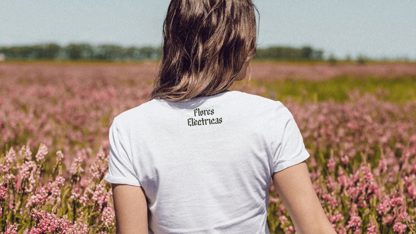
Stories told in disruptive ways.
credits
- Creative Team
- Samuel PortilloCarlos ArneckeFidel HuezoJefferson Flores
Have a brand that needs this kind of thinking?
Tell us what you are building. We take on a small number of projects at a time, across brand, design and performance.