Digitalis
EF_21©24
Context
Digitalis transforms the domain space, much like Bitcoin redefined money: decentralised top‑level domains built on Cardano, the Web3 version of GoDaddy. EL FIN led the art direction and brand identity, developed the entire UX/UI for the MVP, and crafted a scalable design system to support the startup's ambitions.
Domains are no longer just URLs — they are NFTs with ownership rights.
01 — The foundation
Rooted in the harmony between nature and technology.
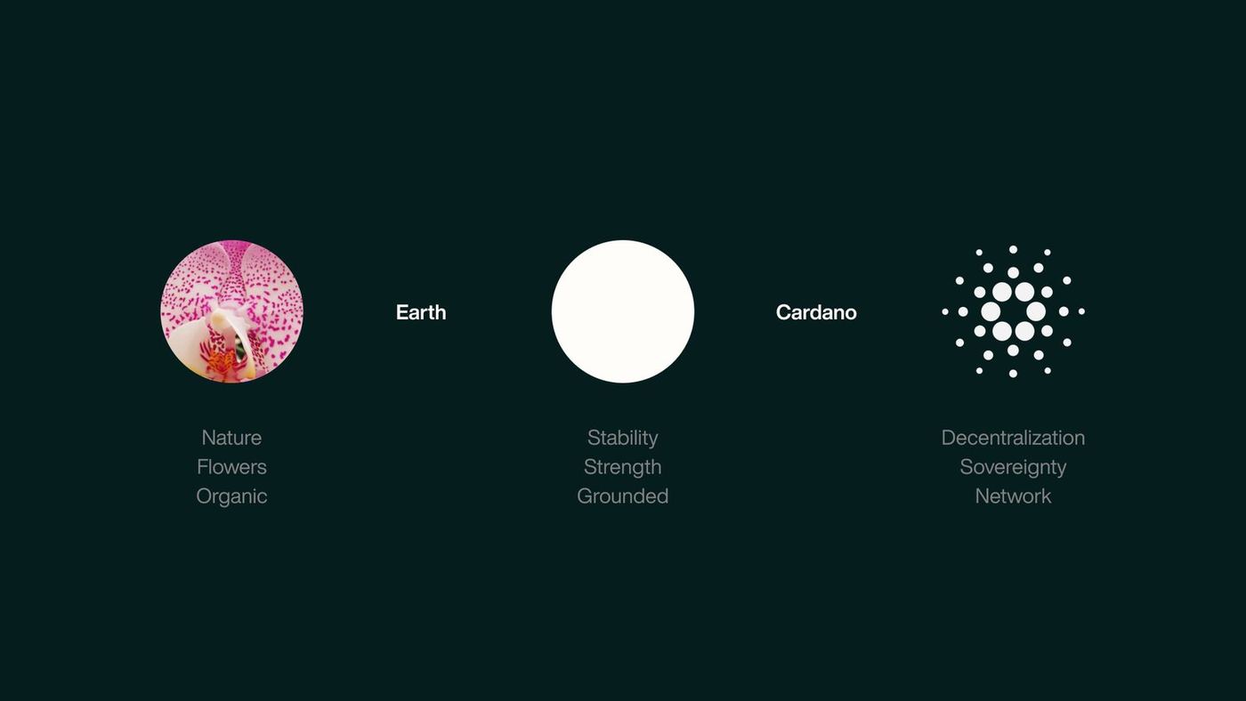
Digitalis draws parallels between the organic networks in ecosystems and the connectivity of blockchain. The foundation balances the synthetic future of digital ownership with an organic feel, bringing natural inspiration into the design to reflect a more human, interconnected vision of technology. Three ideas build it: nature, earth and Cardano.

02 — The brand
Colour
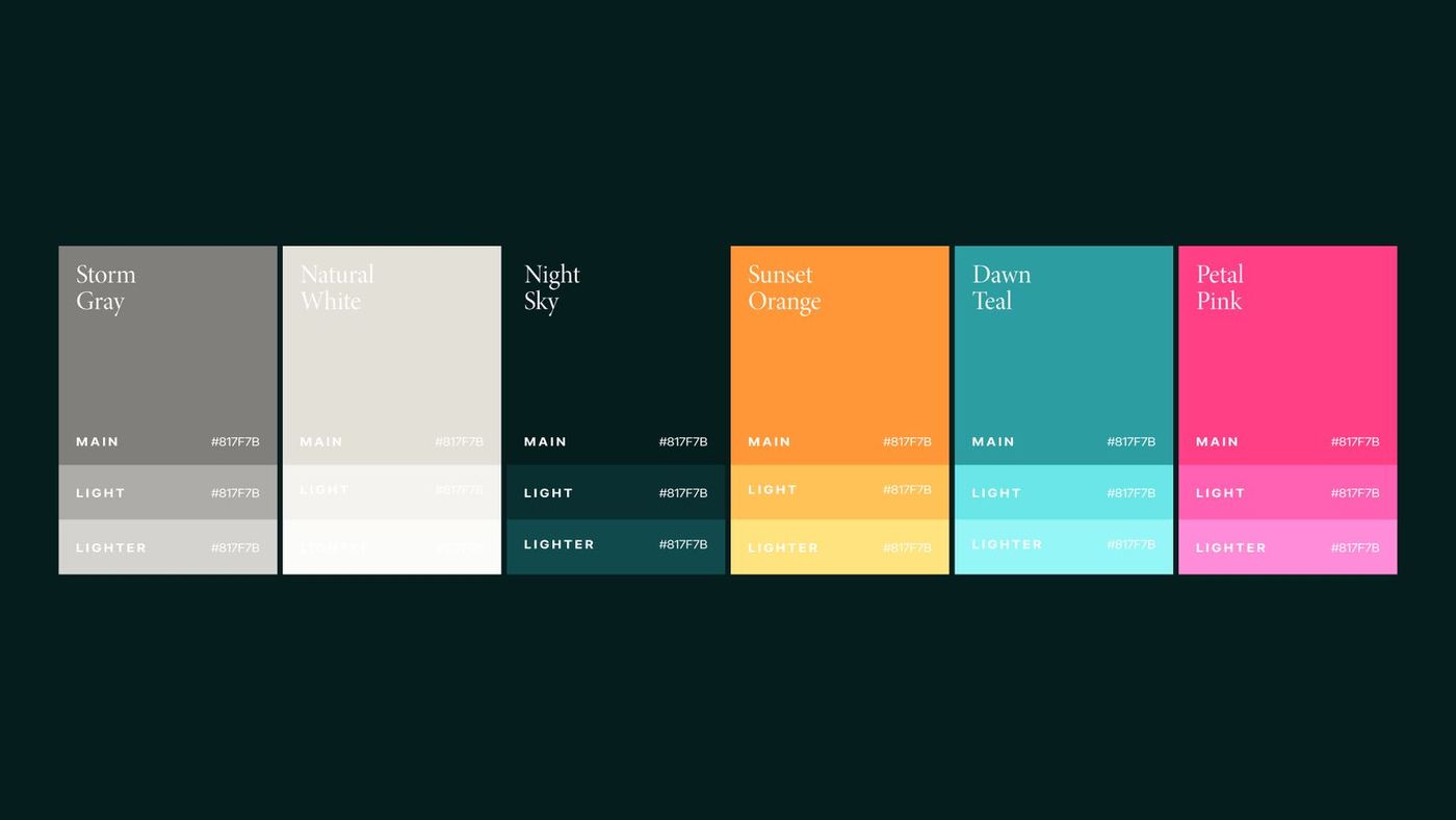
In a field dominated by masculine, tech‑centric colours and rigid design, Digitalis brings a fresh, nature‑inspired warmth: pink, teal, orange, deep forest green, storm gray and natural white, inviting and relaxed yet forward‑looking.
Warmth & future
The colours embody both the warmth of organic life and the promise of future tech, setting Digitalis apart as a unique voice in the blockchain space.
Type
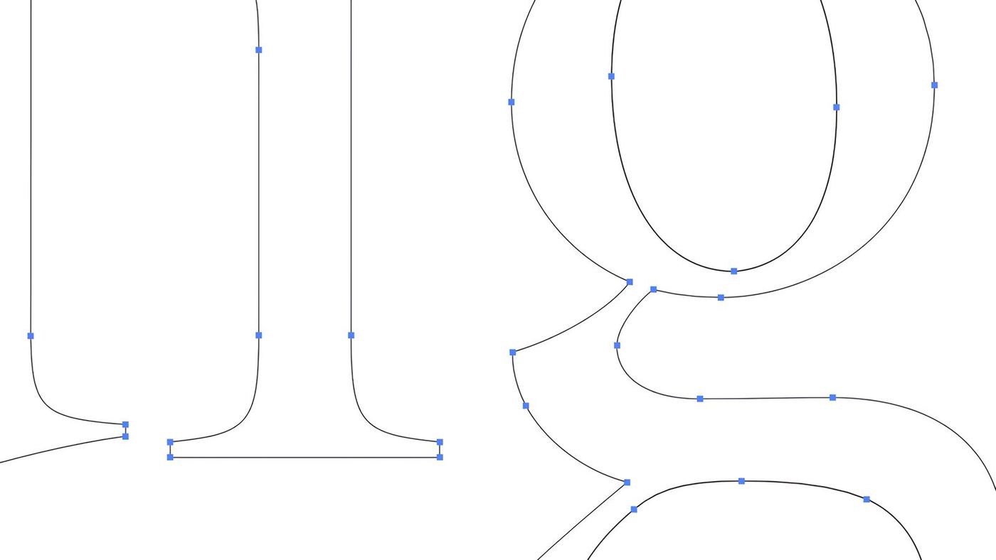
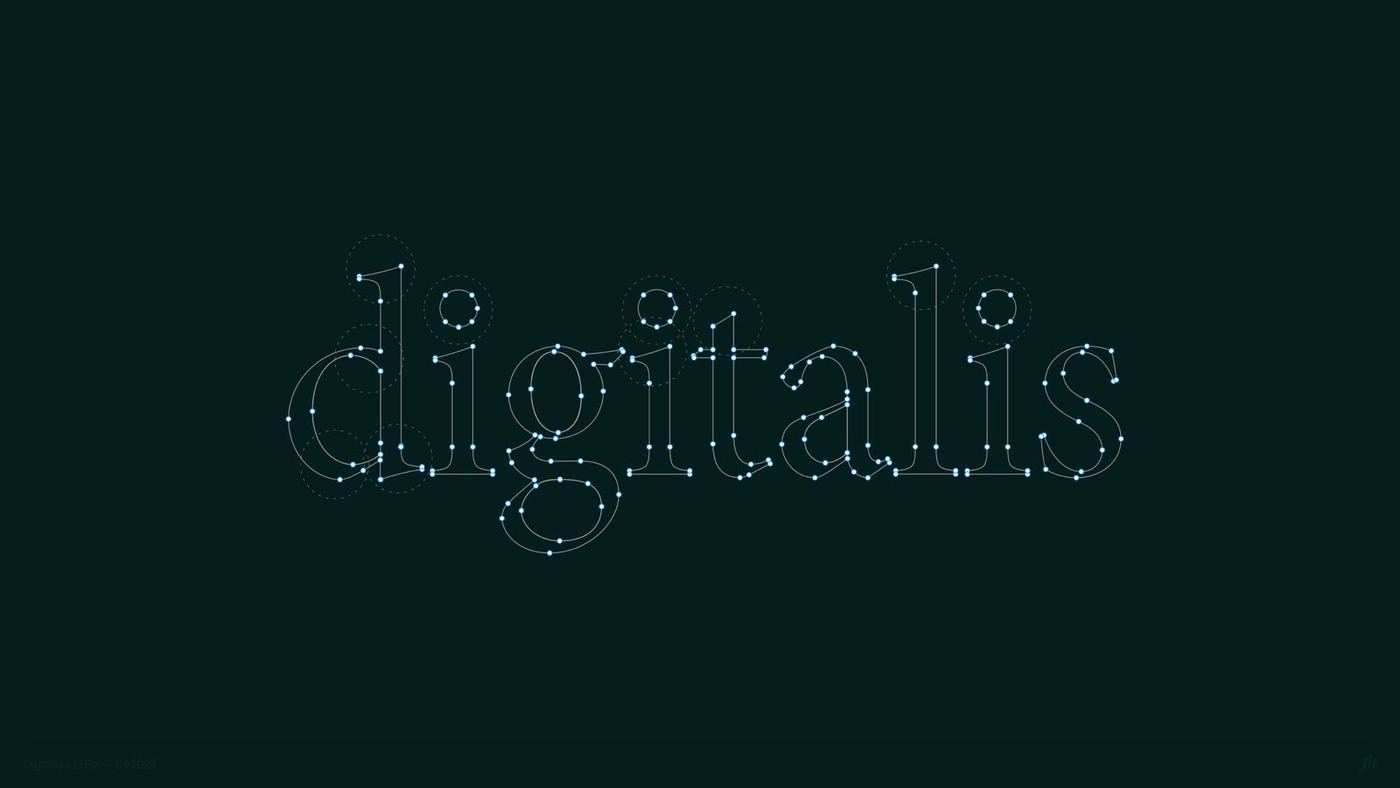
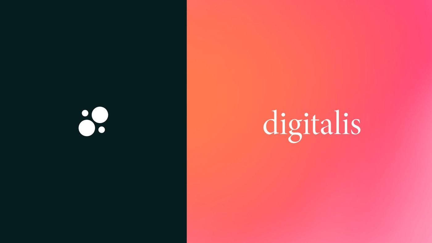
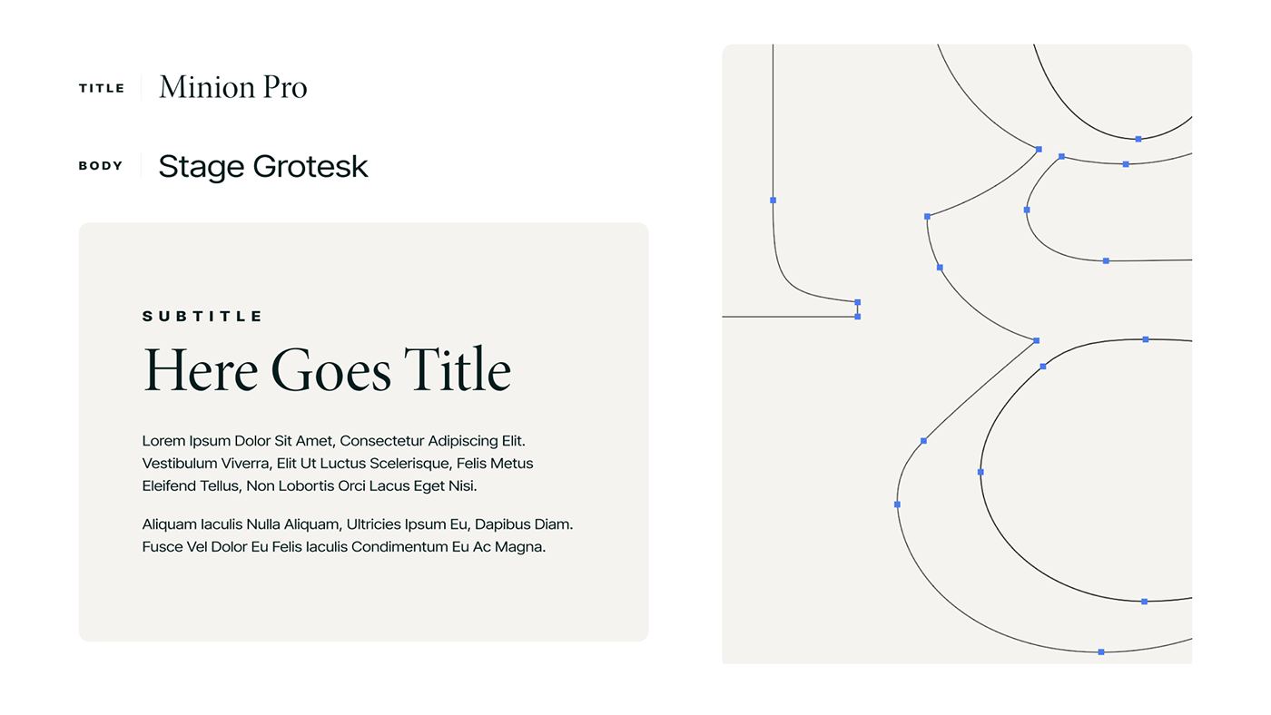
Steering away from typical tech fonts, Digitalis uses Minion Pro, a serif, for a refined, editorial feel. Paired with the clean lines of Stage Grotesk, it contrasts classic and modern: a brand that is confident, approachable and ahead of the curve.
03 — The resources
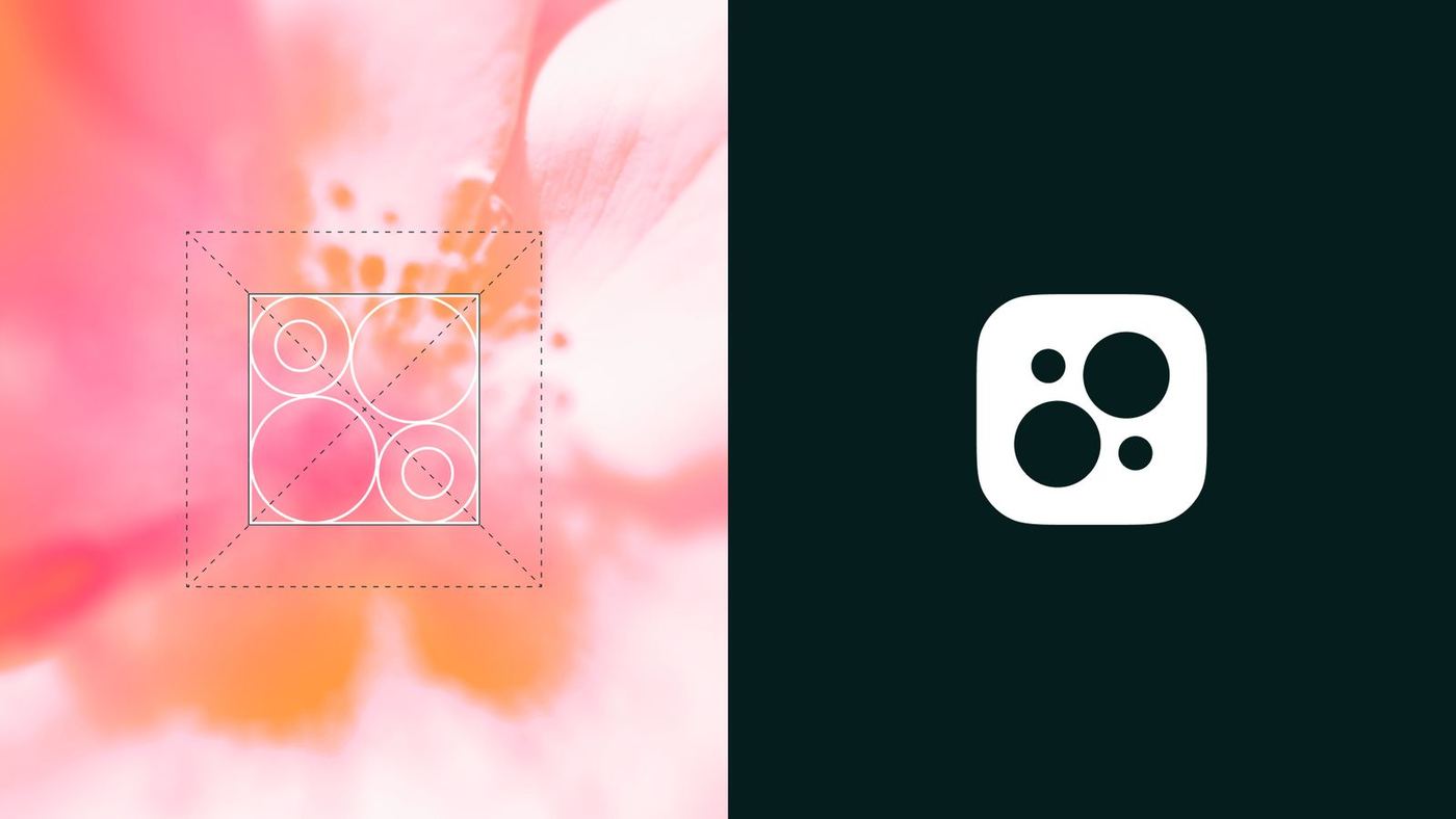
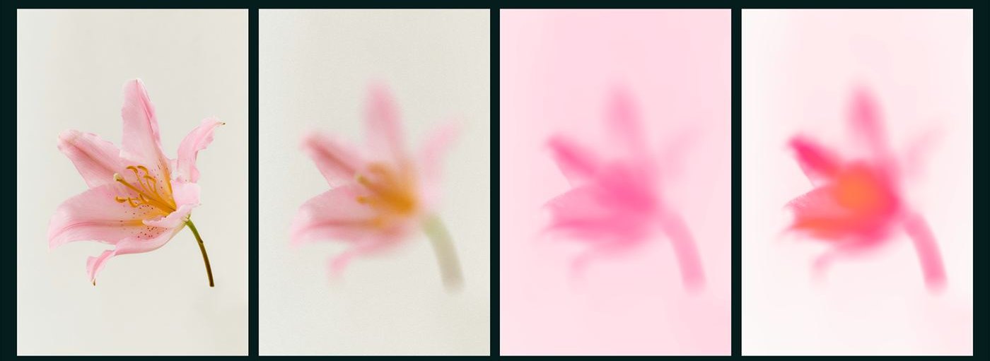
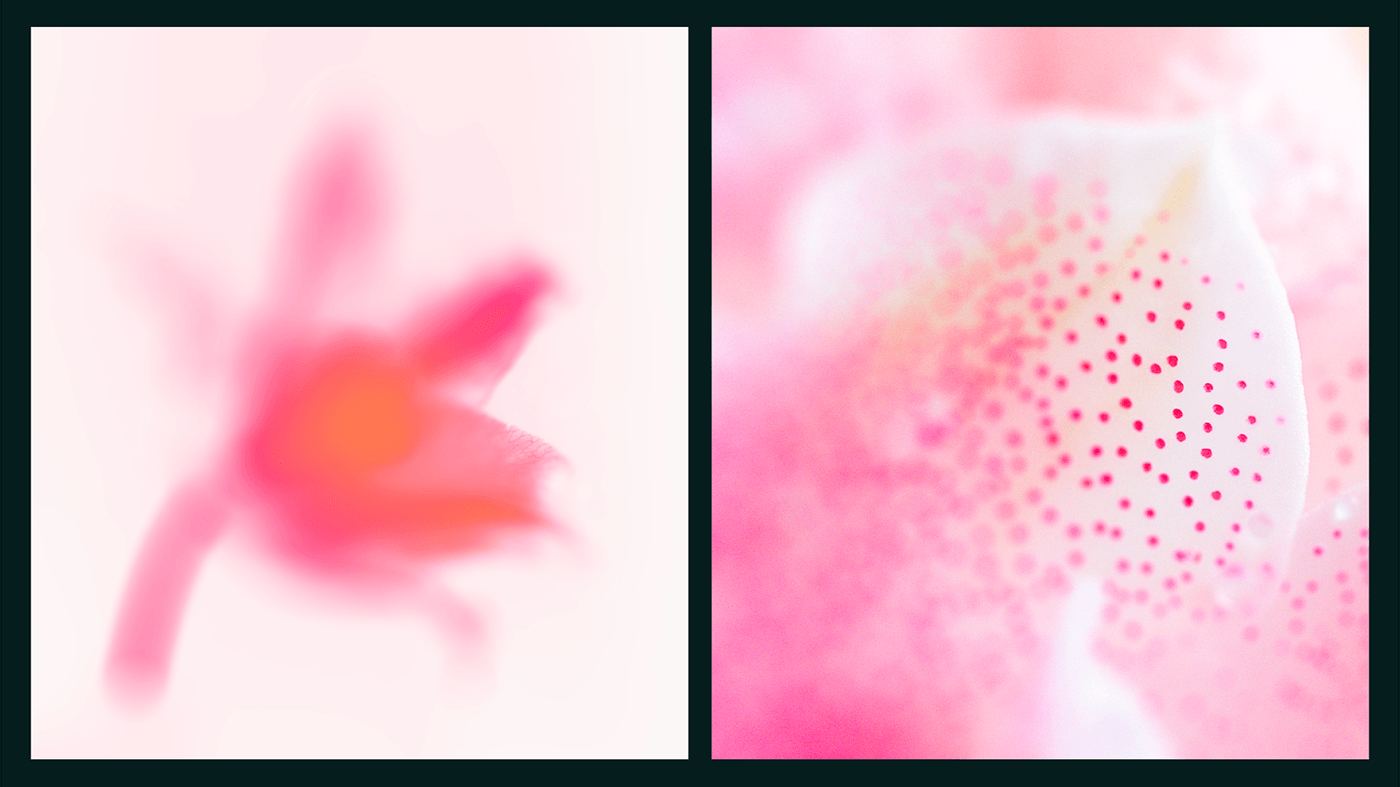
To bring nature into the digital experience, we created custom backgrounds with an automated process. AI‑trained images of flowers, layered with ethereal blurs and gradient maps, generate dynamic, nature‑inspired visuals: original image, a series of blurs, gradient maps, then blending modes. The formula adds a vibrant, organic dimension to every touchpoint: subtle reminders of nature's beauty throughout the brand.

04 — The UX/UI
A seamless blend of simplicity and sophistication, designed for intuitive navigation and mobile accessibility.
Users can secure unique domains such as .ada and .cardano, through auctions or direct acquisition. Balancing function and aesthetics, the interface supports auctions, domain ownership and notifications while conveying the essence of owning something truly digital.

Ownership you can actually hold.
Have a brand that needs this kind of thinking?
Tell us what you are building. We take on a small number of projects at a time, across brand, design and performance.