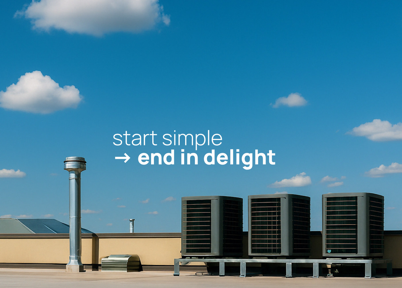
Delight
EF_26©25
Context
Delight is an AI‑powered marketing automation platform for field service businesses. The brand and interface system were developed to make artificial intelligence feel human: present, not futuristic. Through personalised email automation, early adopters reported a 30% increase in profits within their first month.
Start simple, end in delight.
01 — The challenge
The client's goal was to bring enterprise‑level polish to a new AI tool without making it feel distant, and to connect with builders, technicians and service professionals by reflecting optimism, reliability and trust. The visual language draws from clear skies and calm light, a symbol of a good day at work. Every design choice builds on that human benefit: automation as a partner, not a replacement.
02 — Design system
Type choices balance professionalism with approachability.
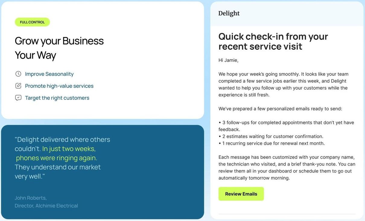
The brand identity extends a foundation of clarity and trust into every customer touchpoint: from emails to feedback forms.
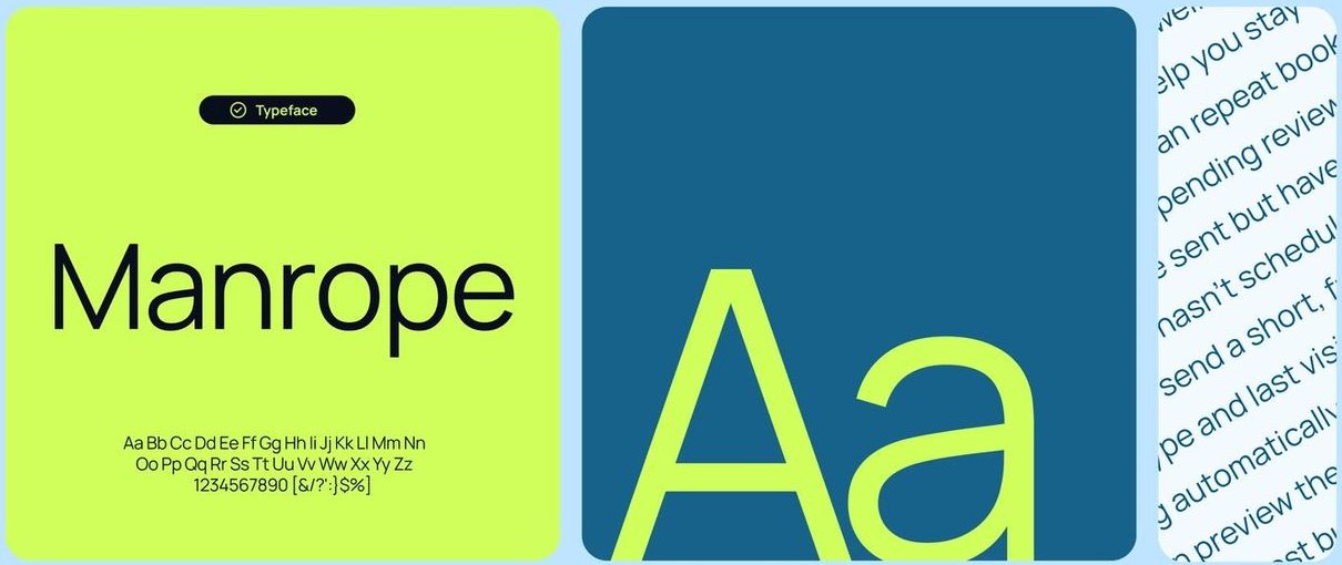
Type
Manrope's geometric sans‑serif shapes bring precision and a friendly tone, carrying the identity into emails, feedback forms and every other customer touchpoint.
Colour
Delight's color system captures the rhythm of a clear workday. Sky Blue opens the palette with calm optimism; Clear Blue keeps the focus grounded and functional.
Action & contrast
Lime Beam injects energy and immediacy into moments of action, while Night Base provides contrast and depth. Each tone contributes to an experience that feels bright, capable and confidently human.
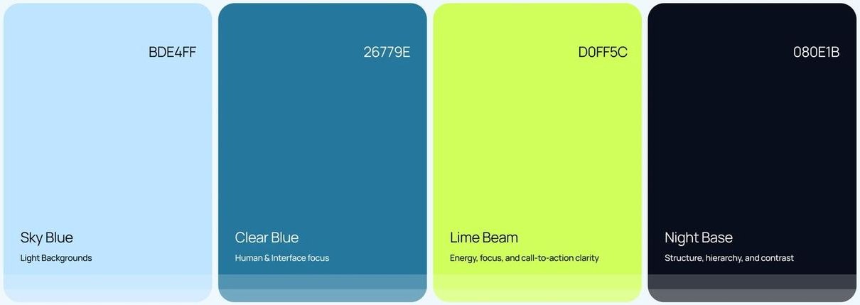
Sky Blue for light backgrounds, Clear Blue for human and interface focus, Lime Beam for energy and call‑to‑action clarity, Night Base for structure, hierarchy and contrast.
03 — AI generation direction
Real people in real light, instead of futuristic AI clichés. The imagery for Delight was generated with OpenAI's Sora, using tailored prompts to reflect the brand's tone: bright, reliable and human. The result is a world that feels tangible and grounded: calm blue skies, confident expressions and genuine optimism. Each image serves as a brand moment, an echo of the system's goal: to make technology feel approachable and useful to everyday builders.

Prompt: a confident technician standing proudly after finishing a job, wearing a navy blue uniform with tools in hand or over the shoulder, under bright blue skies with soft white clouds. Natural daylight, clean rooftop or equipment zone, no clutter. Hyper‑realistic, editorial finish, shallow depth of field, cinematic framing.
04 — Landing page & first touchpoints
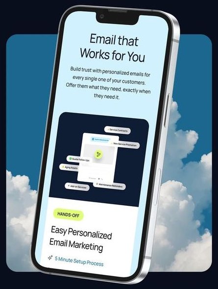
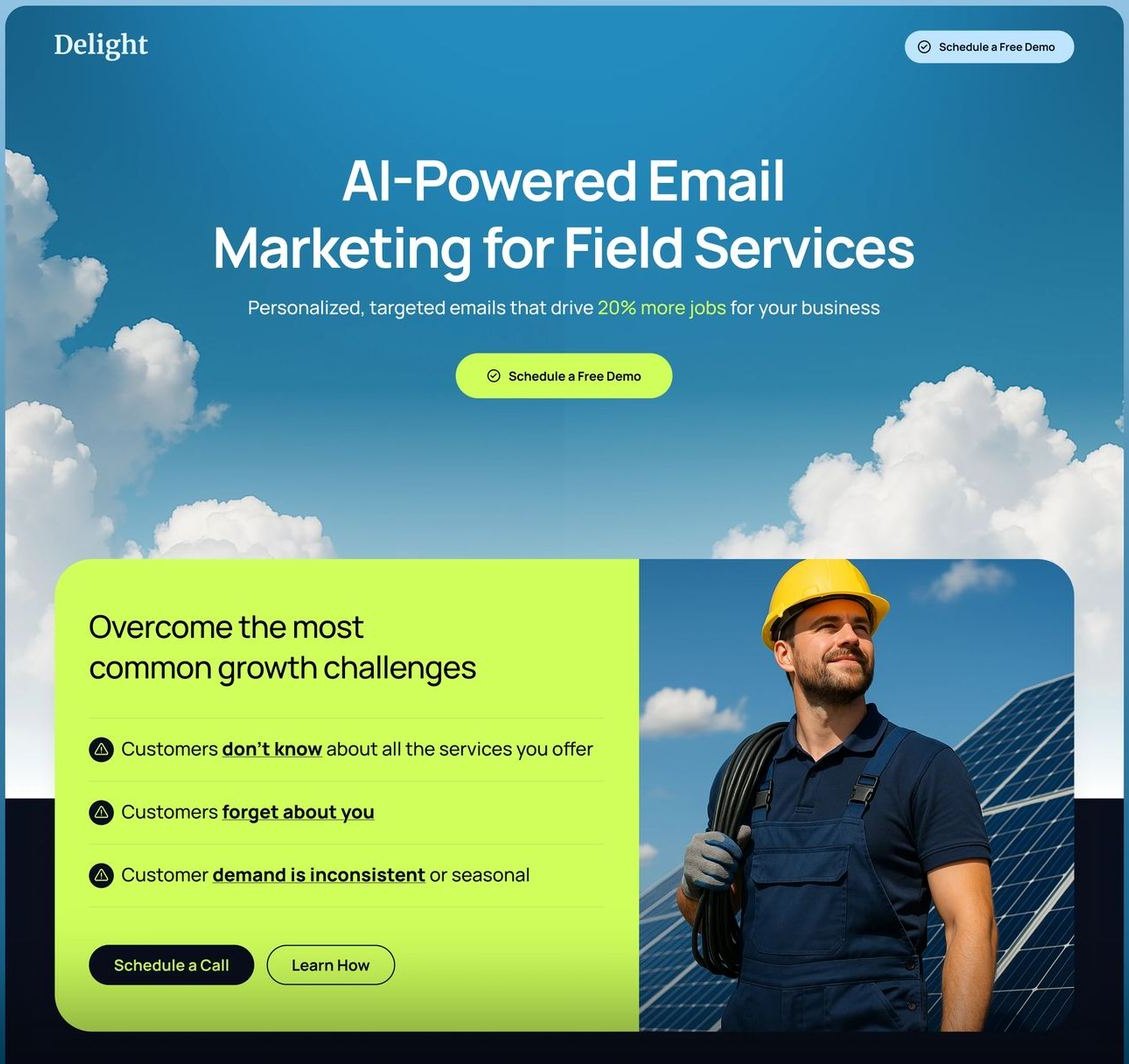
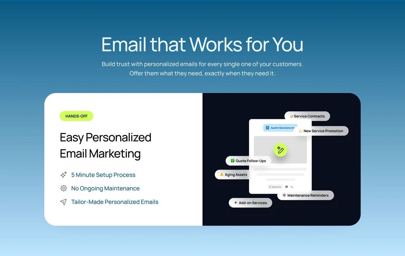
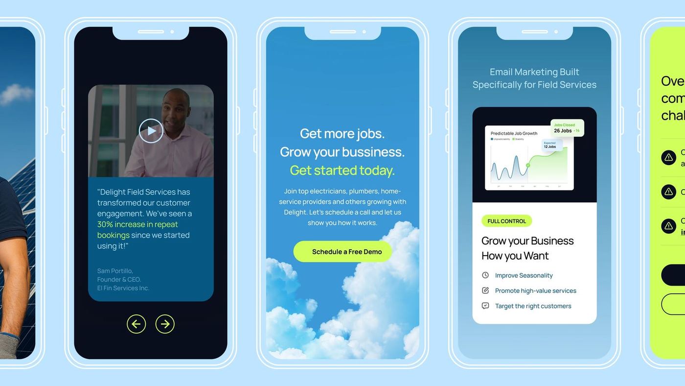
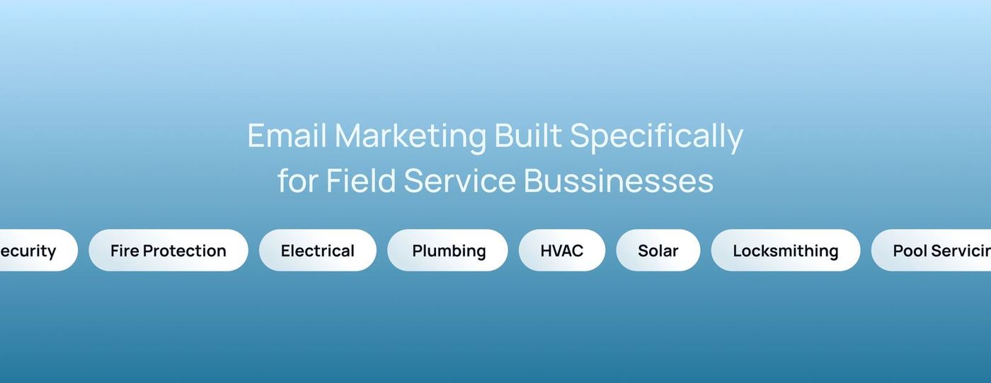
Delight's interface system translates clarity and optimism into every touchpoint.
Each section of the landing page guides users through a simple story: from awareness to action, using consistent hierarchy, color and tone.
05 — In closing
Delight represents what happens when advanced technology becomes part of everyday usefulness. The system was designed to make AI feel like a natural part of daily work: not the future, but the present. From the brand identity to the smallest interface detail, every choice builds trust, simplifies complexity and makes business growth feel human. Clear skies, confident tools, calm optimism. That's Delight.
Automation that sounds like a person, not a product.
Have a brand that needs this kind of thinking?
Tell us what you are building. We take on a small number of projects at a time, across brand, design and performance.