Boocs
EF_01©20
Context
BOOCS is a financial firm specialised in the outsourcing of shared accounting services. It sought a graphic image that fit better within its market, so we redesigned its entire identity, website included.
A financial firm that needed to look like it belonged in its market.
01 — From past to future
From the abacus to the robot: the rebrand moves BOOCS from the past of accounting toward its future.
The new identity places the firm at the future end of a line that runs from the abacus to the calculator, the computer, the phone and the robot, with the old mark left at the past end.

02 — Identity system
Symbol
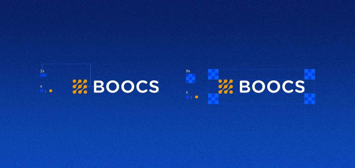
A symbol of linked dots, built on a circular grid. Repeated and scaled, the same unit grows into a pattern that runs off the edge of the page.
Colour & logotype
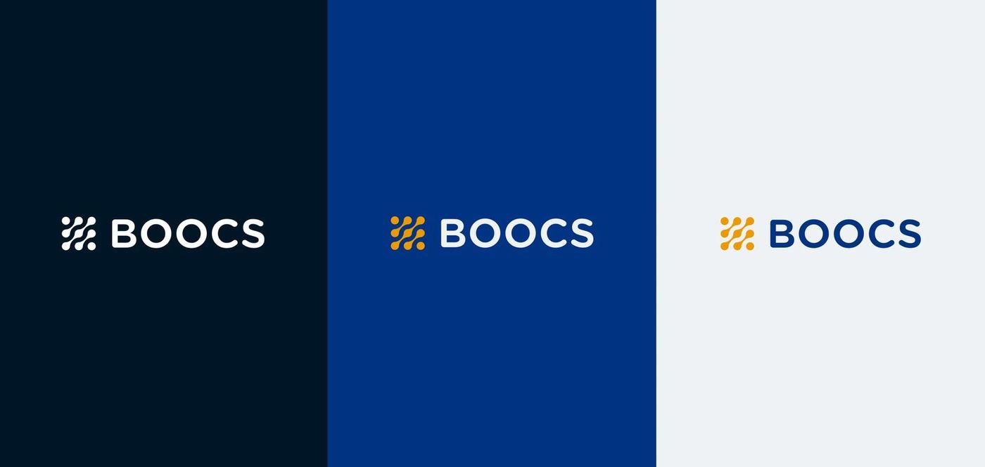
Deep navy, cyan, royal blue, orange and white. The symbol and wordmark lock up with a set clear space, on dark, blue and light grounds.
Typography
Modern and classic together. Source Sans Pro, the sans serif used most across BOOCS's communication, carries its innovative attitude; Libre Baskerville, the secondary serif, brings professionalism and assurance. No other fonts are to be used.




03 — Stationery & print
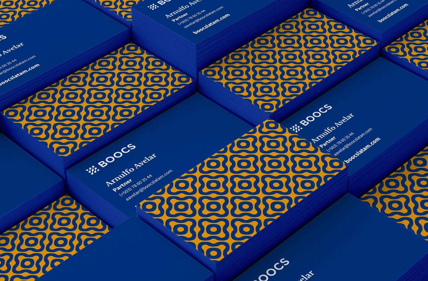
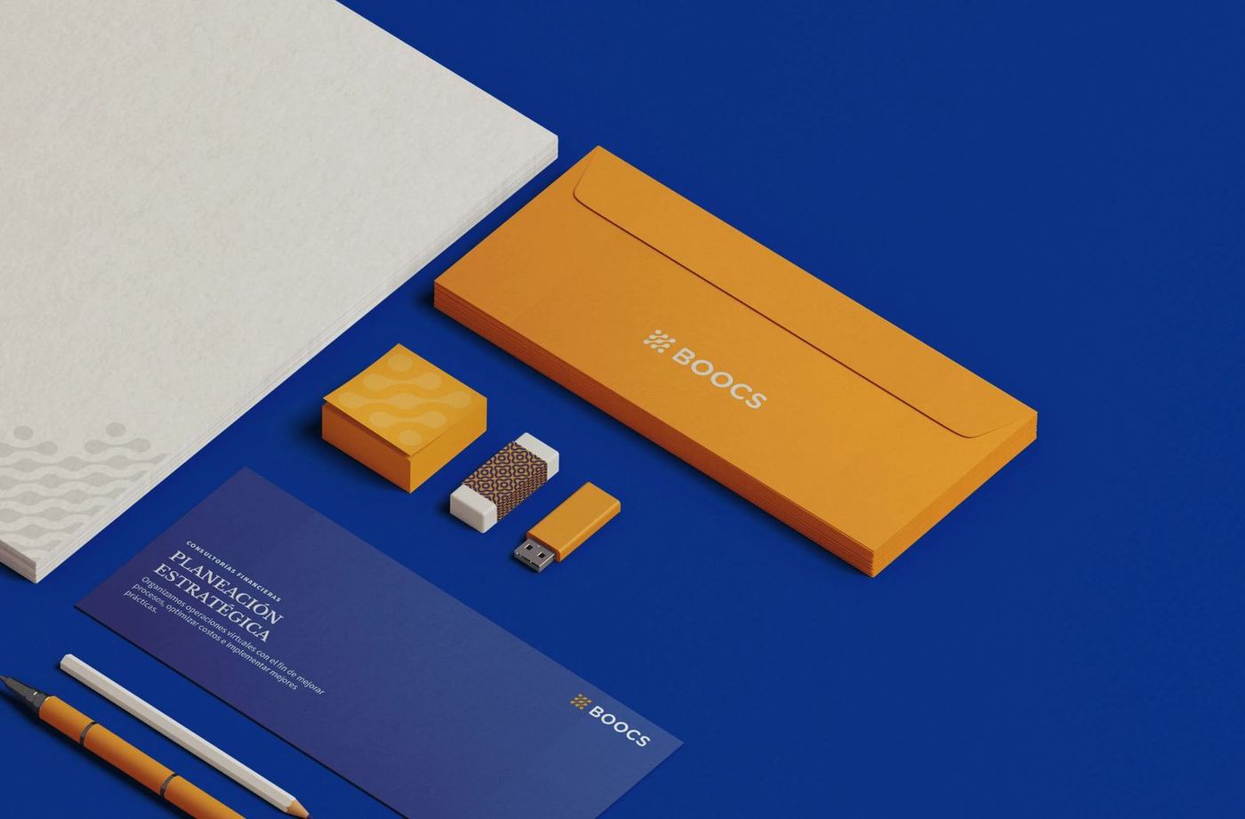
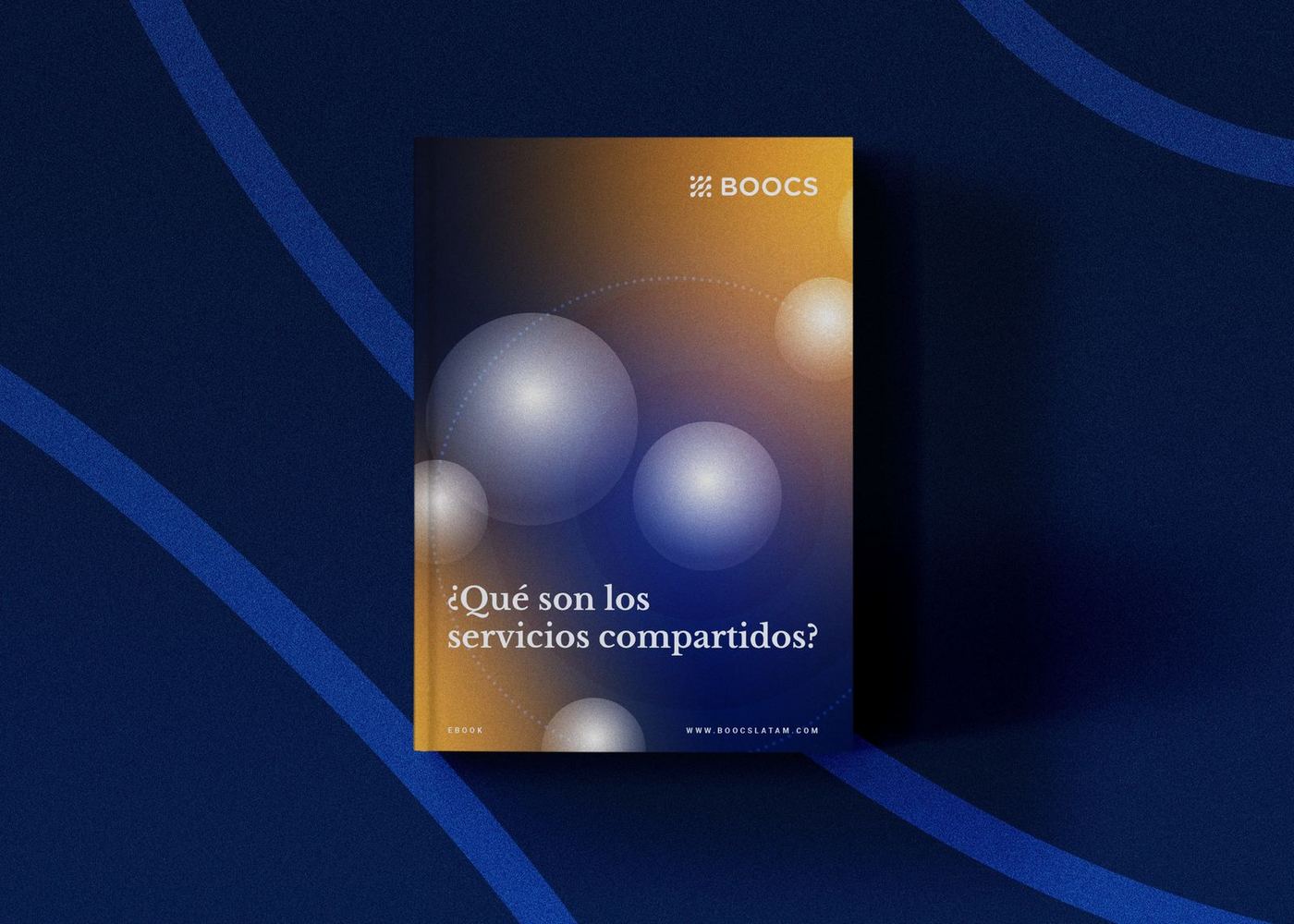
Business cards, stationery and print carrying the pattern and the mark.
04 — Website
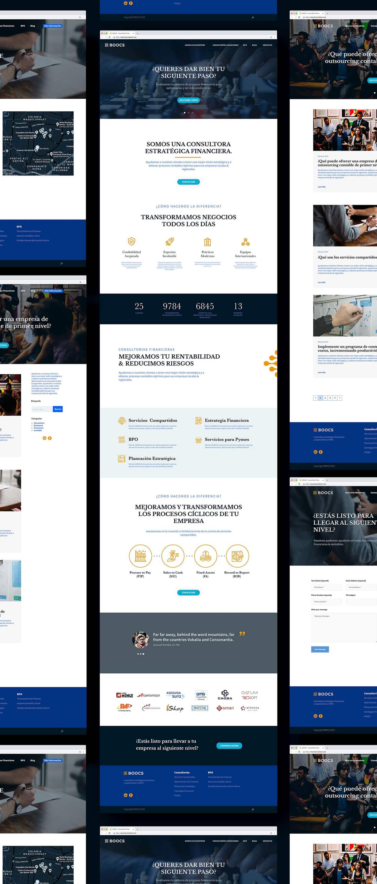
The redesign extends to the firm's website.
Home, services, blog and contact pages carry the navy and blue palette, the orange symbol and the two type families into the firm's main channel.
Accounting that finally looks as precise as it is.
Have a brand that needs this kind of thinking?
Tell us what you are building. We take on a small number of projects at a time, across brand, design and performance.