Be
EF_09©21
Context
A wellness programme, designed with design thinking, that enhances happiness and productivity across every team member of MRO Holdings, offering a wellness ecosystem of motivation, belonging and happiness. Glocal by design: one worldwide programme solving local needs at Aeroman, Flightstar, TechOps MX and MRO Solutions.
Be talks to the people, and encourages everyone to be themselves. To connect with each other and be one with everyone.
01 — Logotype & identity
Happiness is inside of everyone of us.
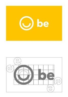
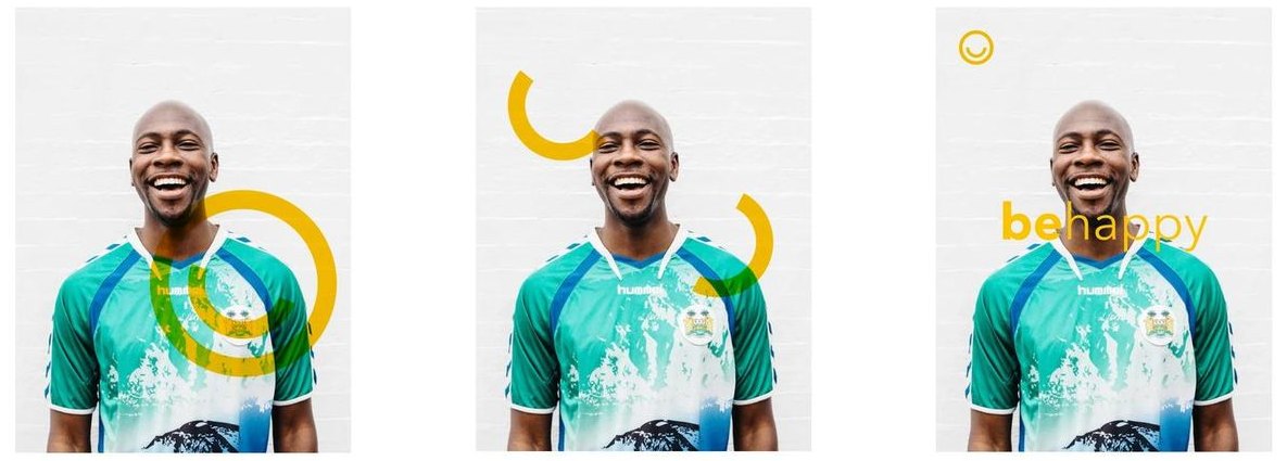
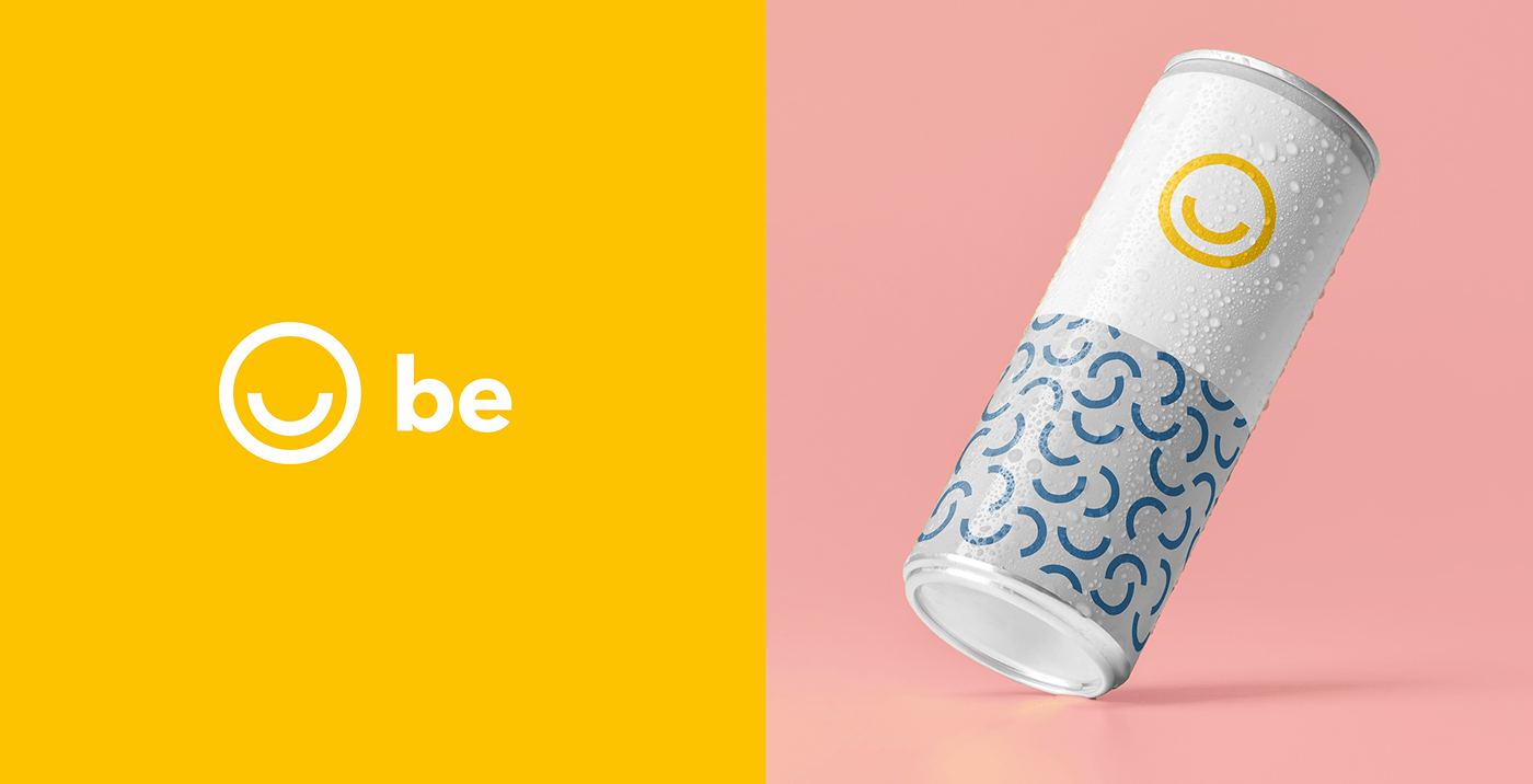
The symbol of Be is a circle, representing one's competition in life. Inside it sits an arch with the same weight as the circle. The combination mark, the integration of the two main elements of the identity, is the main version of the logo across the brand.
02 — Identity system
Use cases
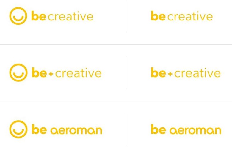
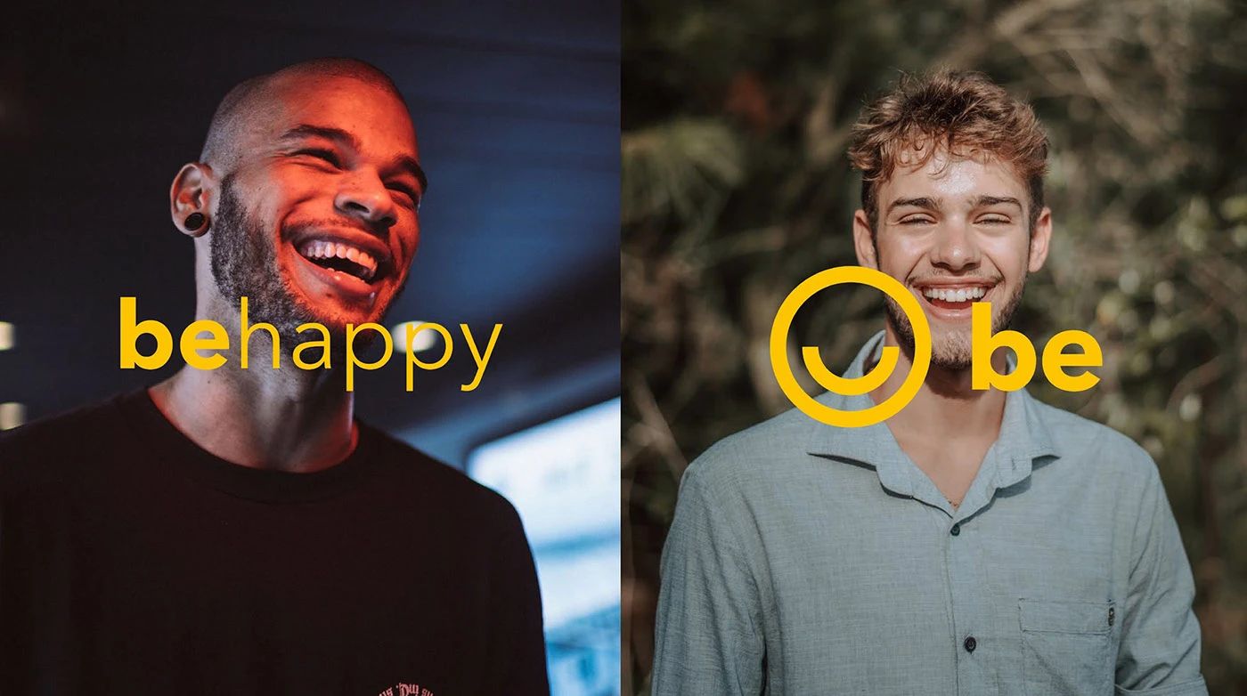
As a phrase, an adjective in Avenir regular follows the logotype to name one of Be's values. As an additive, a sum symbol stresses the value Be adds. As a combination, the user's company wordmark joins Be, reinforcing belonging across MRO Holdings.
Typography
Avenir Next, chosen because happiness is in simple things: a revision of Adrian Frutiger's typeface, used in regular and bold to build the text hierarchy.
Colour
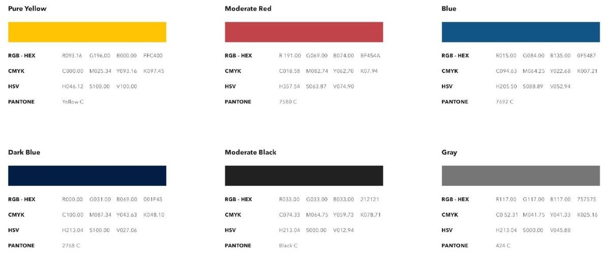
Pure Yellow leads, paired with Moderate Red, Blue, Dark Blue, Moderate Black and Gray.
Compositions
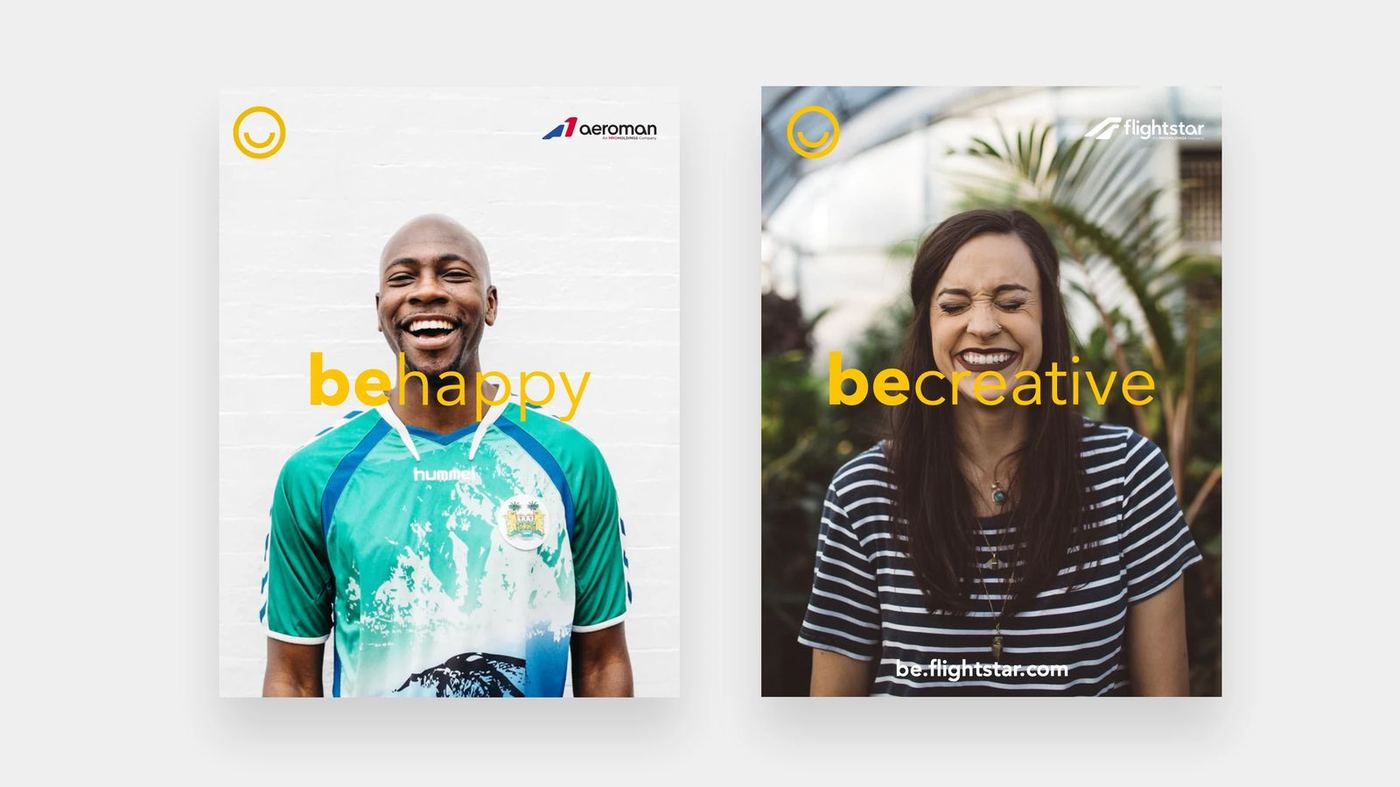
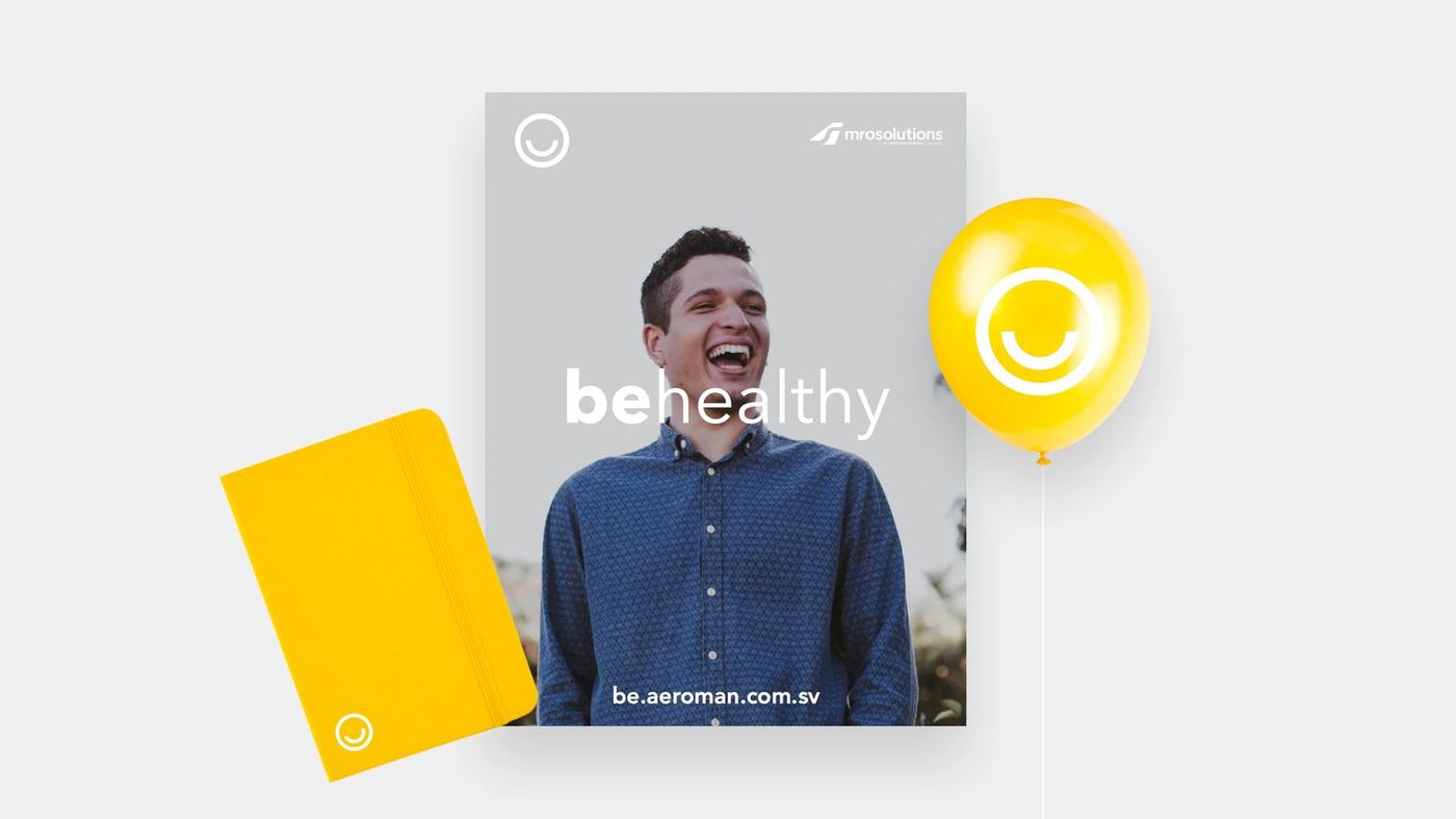
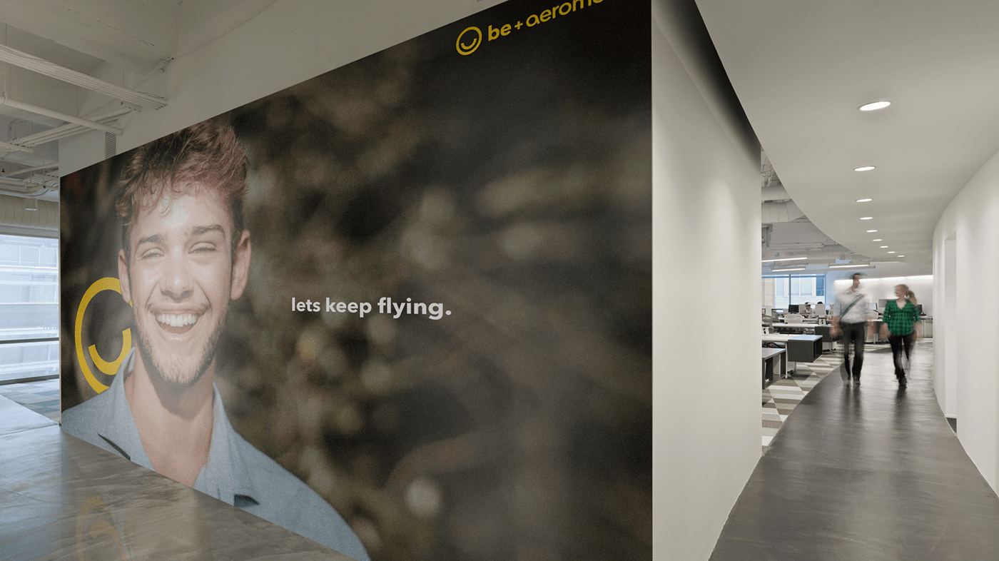
Symbol only, module only, or wordmark and symbol together: rules for how the brand sits over photography of the people it speaks to.
03 — Across the group
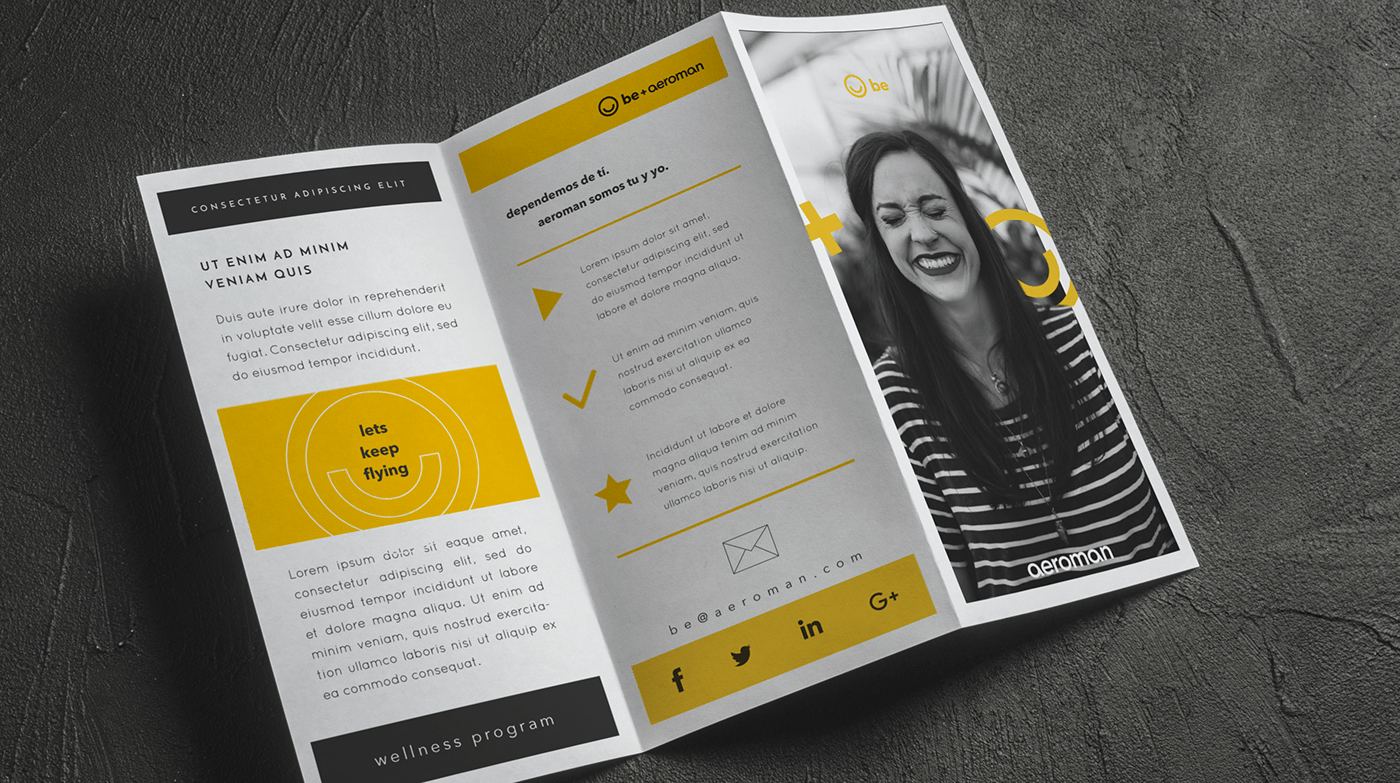
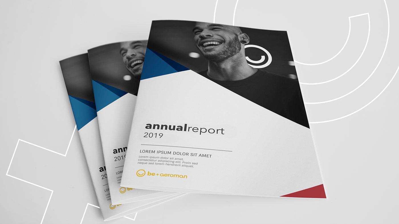
The brand had to speak to current and future workers in three different countries and, at the same time, to investors, clients and external publics: one programme carried into each company and onto the materials people actually hold.
04 — Internal app
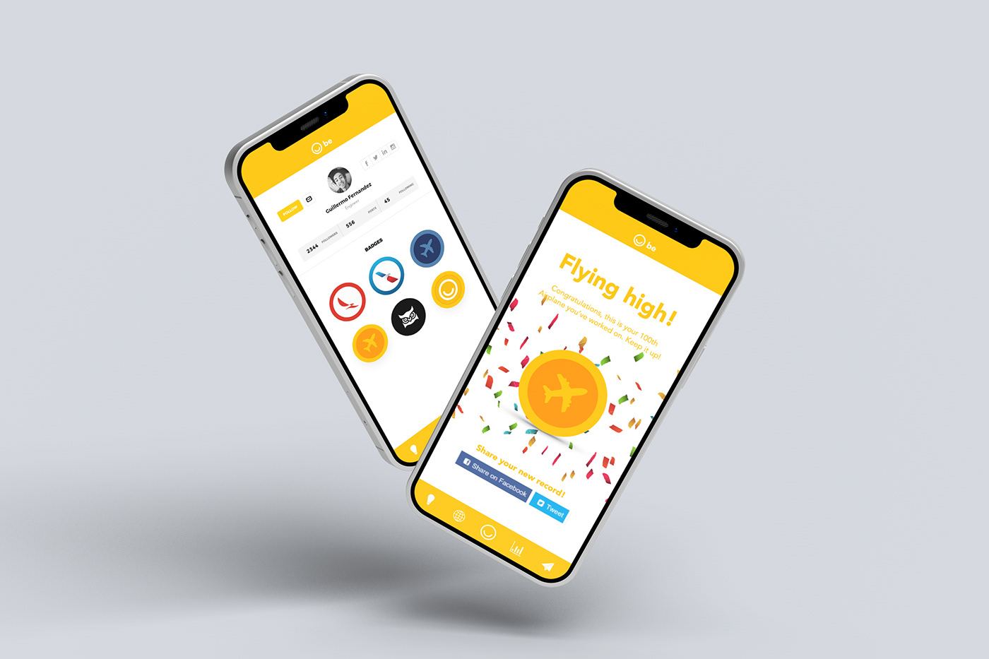
An internal app to help Human Resources engage with 10k+ employees in the US, México and El Salvador.
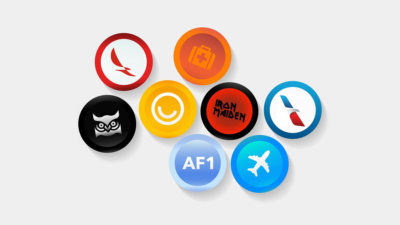
We developed the idea for an app that would keep track of your milestones in the companies, your personal progress, health checks and more.
05 — Pattern & merchandise
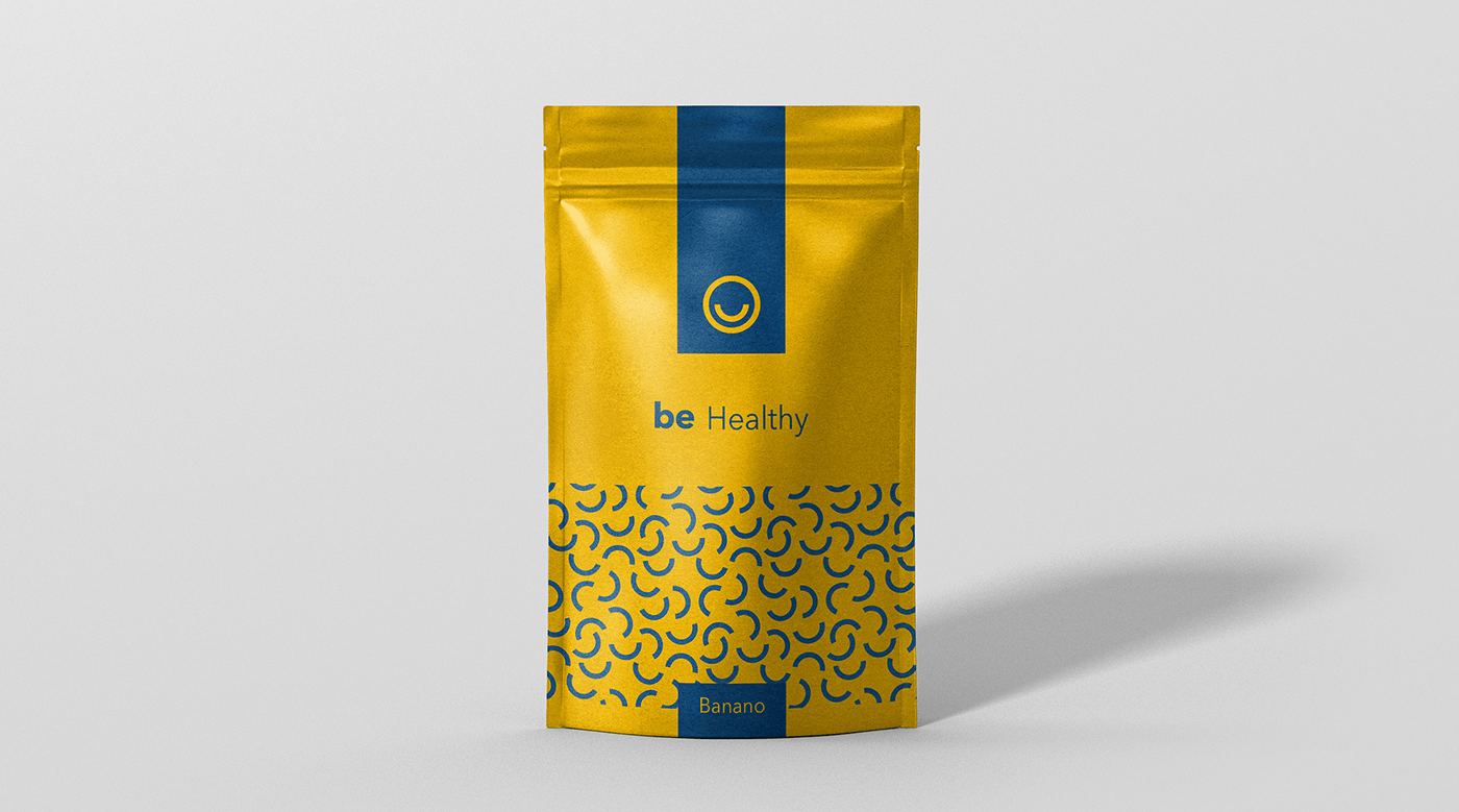
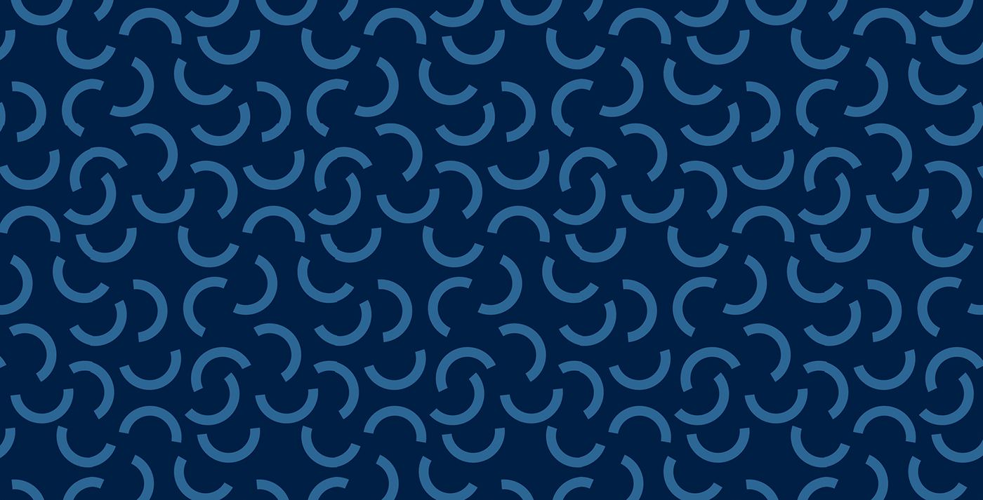
The arch module repeats into a pattern carried onto cans, pouches and merchandise.

A programme that speaks to 10,000 people without speaking over any of them.
Have a brand that needs this kind of thinking?
Tell us what you are building. We take on a small number of projects at a time, across brand, design and performance.